

23 Florist Logo Designs to Help Your Inspiration Blossom
Find inspiration in these 23 florist logos, sorted into 4 categories: Intricate, Wordmarks, Vintage, and Modern.

.svg)
Table of Contents

If you need a custom logo for your flower shop, take a look at these amazing designs that will make you realize you can’t do with a premade logo!
If you’re running a florist business, you’ve probably figured out that a floral logo design template can be very easily found on a logo maker website. It's true, floral designs don’t require too much customization to look pretty. You can get an instant download in a jpg or png file, tweak it a bit in Photoshop to use on your social media profiles, and you’d think that’s enough. But to look distinguishable, there are wonders that only a graphic designer can do.
In this article, we’ll take a look at 25 flower shop logos we curated for you, to give you a few ideas and lay out some logo design tips as well.
{{BRAND_BANNER="/dev/components"}}
Intricate floral logos
It comes as no surprise that the most-used element in florist logos are—flowers! From a monoline style to an intricate watercolor illustration, you can find plenty of examples where flowers stole the show in a logo design. Here are some of them.
1. Fleurist
This beautifully designed elegant logo includes a female hand holding hand-drawn flowers, framed in a hexagonal shape. The safe space of the logo is generous and perfectly spaced on all sides, to maximize the logo’s visibility and impact.
The addition of the clever tagline “Love Delivered” further elevates the experience of this brand.

2. Olivia Johnson
This lovely feminine logo is also a framed emblem with a flower illustration, this time using elegant lilies. The logo designer created a simple version in black, as well as an alternate embossed bronze version to use on business cards, stationery and packaging.

3. Lotus Design
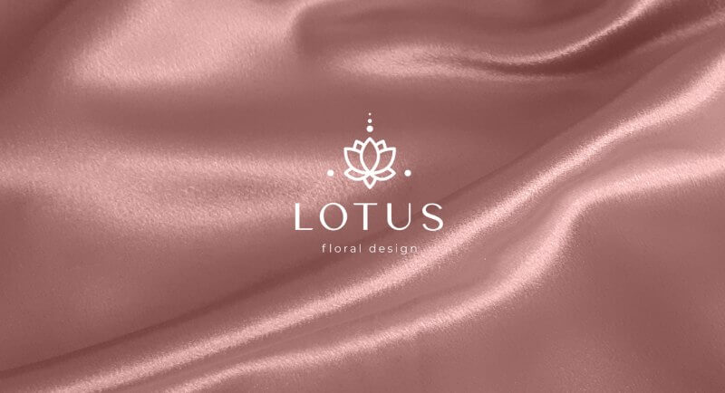
This flower shop went for a more contemporary and minimalist approach with its logo design. A geometric icon of a lotus flower is adorning the logo, accompanied by a wordmark in a classy and extremely subtle serif font. Lotus flowers are also very popular in massage logos, as well as in the beauty industry.
4. Forget Me Not
I may be partial cause forget-me-nots are one of my favorite flowers, but this lovely illustration of the titular flowers and the quirky, scribble-like font used in this logo design, make for an impressive and playful look.

5. Darya Antonenko
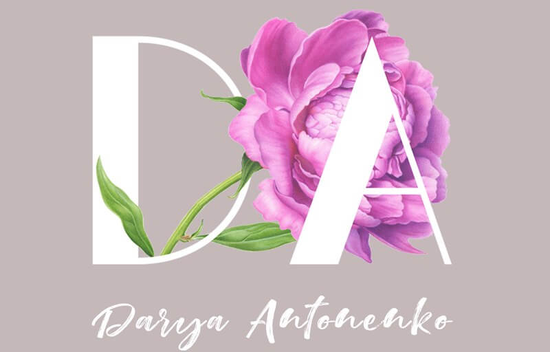
This cool logo has multiple meanings. At first glance, it’s just a monogram for the florist, Darya Antonenko, that has a lovely peony watercolor illustration to accompany it and give it a three-dimensional look. But “DA” means “YES” in Russian, and it’s a nod to wedding floral design since this professional is mostly decorating at weddings. Finally, the name of the florist is added in a calligraphy font to help make it memorable.
6. Blóm florist and café
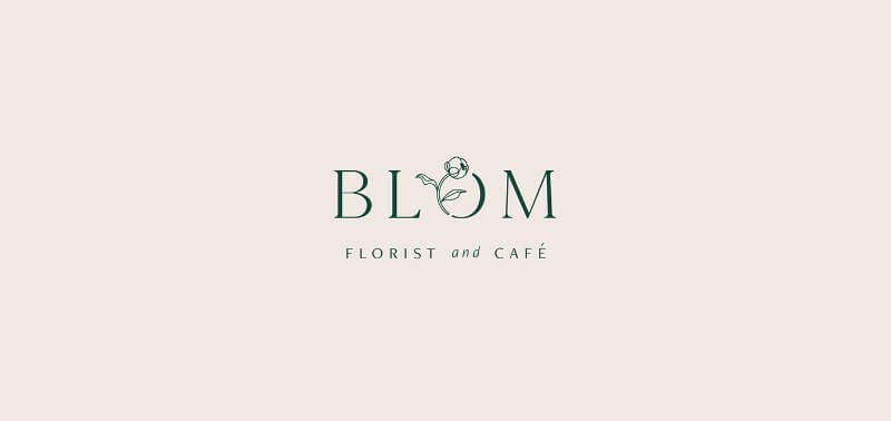
This lovely rose logo framed in an eclipsing circle is proof of how creative and smart graphic design can be. The circle alludes to a stain mark from a coffee cup, a nod to the fact that this flower shop is also a café. And if you didn’t think this concept is cool enough already, they also serve menu items inspired by plants, as well as edible flowers.
7. Orla Bloom
The last illustration logo on this list shows a wildflower, paired with a flowy, Art Nouveau-inspired typography. The detailed drawing and the subtle and elegant ligatures make this a lovely design that is easy to imagine on a t-shirt or on packaging.

Wordmarks: a recipe that never fails
Wordmarks, also known as logotypes, are a great way to make your business name stick and use a versatile and classy design in all your marketing and branding efforts. Check out some flower shops and florists that went with this approach.
8. Flùr
This brand logo uses a clean sans serif typography sprinkled with a single element that looks like a flower petal. The petal is further used in creating an abstract pattern for the packaging and other collateral material for this florist’s shop in Toronto.

9. Flox
Flox is a unique flower shop where the customer can arrange their own bouquets. The unique service and experience are encapsulated by the tagline ‘We curate. You create’. For that reason, the wordmark created is modern and friendly but still has a refined edge. The font is quirky and Boho-inspired, while the color palette is soft and feminine.

10. Lunaria Annua
This simple wordmark shows the true meaning of properly pairing up different font categories to create a unique and stylish look. Through a bulky serif and script font combination, the designer made a lovely new logo that is versatile, simple and resilient to the changing trends of logo design.

11. Poeme Flores
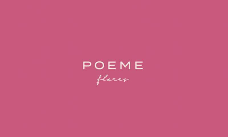
Here is yet another example of mixing a classier, more legible typography with a calligraphy script font. This time, it’s a pure sans serif font, and a more free-flowing handwritten secondary font.
12. Floral Lush
This lovely logo uses a decorative sans serif font with long ligatures that overlap on some of the letters, much like flowers that grow tangled and create a natural tapestry of colors and textures. It is a very contemporary and playful design, suitable for logos in the beauty industry or wedding planners.

13. Gardenia
This Slovenian flower shop went for a more luxe look, with a fancy geometric serif font and sharp endings and corners of lettering. The color palette reminds of greenery and nature, but also quality, trustworthiness and elegance.

Vintage design for the nostalgic souls
Vintage and retro might be old, but it’s never out of style. Of course, the definition of vintage changes as much as trends themselves, but these logos are sure to be evergreen.
14. Bergamote
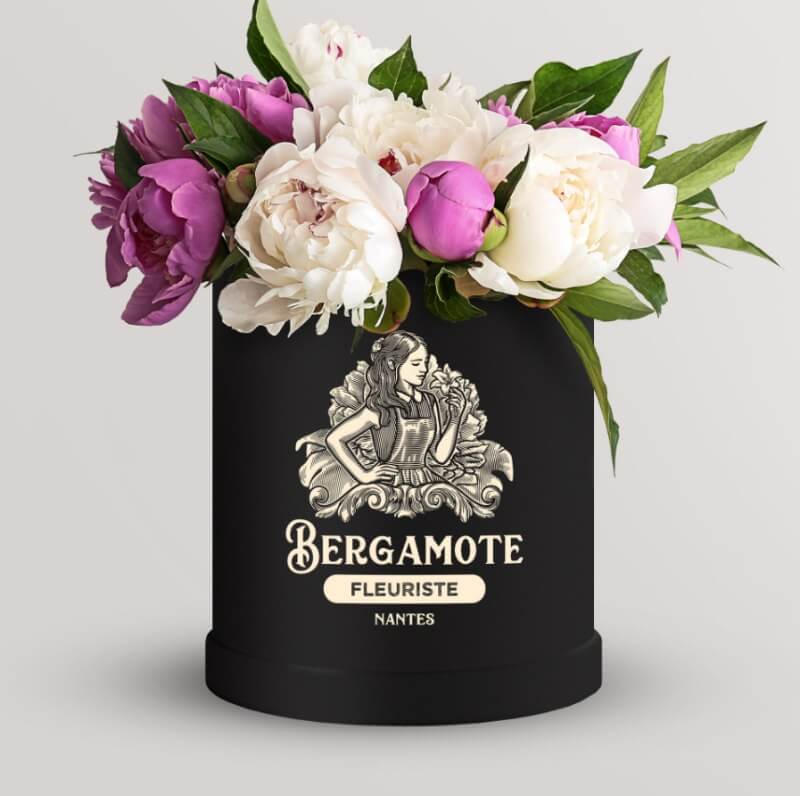
This Victorian vintage, black and white wood-carving style logo is detailed, intricate and very on the nose. Who wouldn’t want to see a pretty girl happily sniffing her flowers? As you can see from the mockup, it’s great for use in packaging too.
15. Soul & Basil
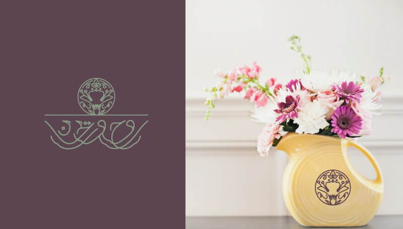
This elegant mono-line design is inspired by the business name—Rawh wa rayhan, meaning Soul and Basil in English. The logo combines a basil flower and leaves, as well as the Arabic letter Raa. The illustration is created to fit with the typography perfectly.
16. Morrice
This old-school emblem style logo has a classy and simple serif font, a lovely pictogram of a flower and heart merged into one, and a very important little detail that distinguishes the brand from many other florists. The date this business was established is 80 years ago, and that is something to take pride in and include in the logo!

17. Flores
The Flores flower shop in Porto takes inspiration from vintage emblem logos but gives its own a modern and simplistic touch. The trendy one-line illustration style is paired with a circular emblem and a more contemporary serif font, to tie up nicely popular looks of the old and the new.

18. Bud & Blossom
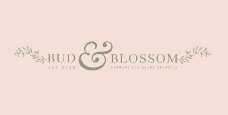
The designer of this logo wanted the branding for this brand to be elegant and sophisticated, but still have an element of fun that would make the design stand out. That is why she made the ‘&’ stand out and pop out of the overall look, whilst also using it in alternative versions of the logo.
19. Eco Flora
This unused concept combines a vintage font with a nice illustration of a mascot—Eco Flora. It is a unique idea, as not many florists have a mascot for a logo, so it is a shame it’s not used.

20. Haleiwa Lei Co.
This logo is done for a tropical florist, whose arrangements grow and are created in Hawaii. Suitably, the design is inspired by folklore, native art and infuses notable flowers that adorn a traditional lei.

A modern take
If you really want your business logo to pop out from the competition, you might want to go in a totally different direction. Modern minimalism, flat illustrations and pastel colors are some of the most influential trends at the moment.
21. Blush Parnell
Instead of creating a naturally interlaced, circular and organic pattern, the logo designer here made a geometric pattern inspired by the composition of petals in a blossom. It is a minimalist take on nature’s most beautiful creations.

22. Flower Farm
This flower shop mostly prides itself in their home-grown dahlias, which are depicted in this geometric pattern of a birds-eye view of the flower. The interesting thing about this logo is that no matter how you turn it around, it’s perfectly symmetrical.

23. Yen Flowers
This is perhaps the most colorful, and the most contemporary look on this list. The “Y” consists of three tulip petals in different colors, giving it a mosaic look.

Journalist turned content writer. Based in North Macedonia, aiming to be a digital nomad. Always loved to write, and found my perfect job writing about graphic design, art and creativity. A self-proclaimed film connoisseur, cook and nerd in disguise.
A design solution you will love
Fast & Reliable
Fixed Monthly Rate
Flexible & Scalable
Pro Designers


