
21 Gorgeous Gardening Logos
Give your gardening service a professional glow up by creating a great new logo. Here are some awesome examples to inspire you.

.svg)
Table of Contents

Give your gardening service a professional glow up by creating a great new logo. Here are some awesome examples to inspire you.
With the rising awareness of climate issues, as well as the organic production trends in the food industry, gardens and urban green spaces are given much more attention in recent years. Moreover, many people transformed their gardens into instant vacation spots due to covid-19 travel restrictions.
This means that it’s as good a time as any to revisit your gardening or lawn care company’s branding strategy and start working on growing your business. If your logo is looking a bit outdated, here are 21 amazing examples that will inspire you to create the perfect logo for your business and get more clients in the coming years!
{{BRAND_BANNER="/dev/components"}}
Logos with gardening tools
Just like plumbers, electricians and woodworkers, gardeners are often associated with their tools. Simple vector images of gardening shears, spades, watering cans or gloves are something you might even be able to find with free templates found with online logo makers.
However, for a fully custom approach, make sure that your gardening tool of choice works with the overall logo design.
1. Plantify
If you opt for using some sort of graphics in your gardening or landscaping business logo, chances are that you’re at risk of making something way too intricate and complicated. The danger here is that although a highly decorative logo might look good on paper, it might not work out across different uses like your business cards, letterheads for invoice templates or even uniforms. This great modern example merges nature and tools into a simple brand mark that looks professional and crisp.

2. Landscaping logo
Here’s yet another leaf-spade combo that works great for a landscaping logo design. This cute brand mark features a more natural-looking leaf, but the detailing is still kept to a minimum whilst creating a memorable brand identity.
3. Home Grown
If the previous minimalist examples aren’t your cup of tea, and you’re looking for something a little more intricate for your own logo, consider this cute retro design. The chalk font and two illustrations are very cute and perfect for packaging, in case your gardening company also offers the possibility to purchase seeds or other garden tending products.
4. Northern Quarter Greening
This next logo example is venturing out into wordmark territory, however, what’s really interesting about is how the logo designer incorporated gardening tool imagery. Using the N as a watering can is very creative, yet not at all forced.
5. Gardening logo
Although this lovely logo doesn’t belong to any company yet, it certainly stands out from the usual, boring logo templates. The design elements are quite simple, yet together they create a stunning brand identity design that would fit a lawn care business for example.

6. M. Scott Gardening Services
Many gardening businesses are actually solo ventures, so it makes sense to use your own name in logo design. However, make sure that you stand out from any other business or instance of personal branding with a more industry-related approach. This simple and crisp design incorporates all the necessary elements while adding a personal touch with the gardening professional’s name.

Logo design inspired by nature
Of course, another source of imagery that’s definitely going to be related to your brand is the natural world. From flowers and trees to bees, there are so many beautiful images you may want to include. However, be cautious with floral logos, since people might mistake your company logo for a florist or even a beauty or massage center.
7. Glade Gardening Services
This beautiful intricate logo perfectly captures what this company is all about. The company name is seamlessly integrated with the graphic elements, making it clear that this a custom logo.
8. Willoughby
Of course, if you opt for a nature-inspired logo make sure that your choice of typography works to elevate and strengthen the brand. A heavy slab serif might not work so well with gentle natural imagery. In this case, the graphic designer opted for a combination of two professional fonts that complement the nice brand mark, which is perfect for use on social media profile photos.

9. Matteo Todeschini
This garden care company logo has a lovely romantic look with a strong sense of personal brand. The two different color versions of the logo allow for more versatile use.

10. Jaws Dry Garden
This design created for a logo contest was meant for a succulents shop. Using succulents over flowers is a good way to distinguish yourself from florists’ logos. The colors are stunning and would work equally well in print and digital use.
Professional wordmarks
Typographic logos or logotypes are a great choice for any business wanting to appear more established and professional. That said, gardening businesses can definitely be more creative when it comes to the choice of typography than some other professions. Here are a few great examples you can use as design inspiration for your own logo.
11. Grab N Grow
This funky retro logo still feels very fresh and modern. As you can see from the branding project, it would make a wonderful addition to packaging, business cards and even web design. The great thing about a wordmark such as this one is that you can create versions in different colors to add a bit of visual interest to your designs.

12. Growbox
While experimenting with colors can be great, remember that your choice of color is also an integral part of your brand identity. This simple wordmark together with a cool monogram version looks particularly good in the combination of green and white, with dark blue as a secondary color.
13. The Garden Hub
This one is not strictly speaking a wordmark since it also includes the cute graphic element of a bee (another great image to consider for your gardening business logo). The design studio behind this logo also used wonderful crisp typography and a very nice color palette that gives the brand a professional, yet approachable look.
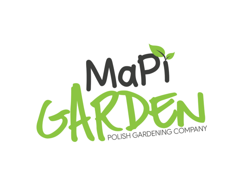
14. Mapi Garden
Without too many details, a custom font can make your logo stand out from any free design template. The handwritten font for this Polish gardening company gives the brand a fun and memorable look. It’s also something that would appeal to youthful audiences that are increasingly starting to grow their own food in an attempt to eat organic products and achieve more sustainability.
15. Golden grower
As a city girl, when I think of gardening services, I always imagine luxurious mansions with huge gardens that need professional maintenance. Although of course there’s a niche market for everyone, this logo really captures that sort of sentiment well. The gold and green are a lovely color combination, while the mix of a sans serif and serif font gives the wordmark a more interesting look.
16. Garden Box
This logo design is an unused concept for a subscription-based service that provides specialized flower/plant arrangements delivery. It’s a shame since the logo is very decorative, yet crisp and modern, perfect for this kind of innovative service.
17. Le Jardim Paisagismo
Let’s finish this section with another garden logo that’s all about luxury and class. Contrary to what non-designers might think, creating a good wordmark isn’t just about choosing the font and writing the company name. This also takes great graphic design skills, as you can clearly see from this example. The logo designer achieved symmetry, flow and a unique logo that will look great for a number of different purposes.
Modern minimalist logos
Minimalism is a big logo trend, especially in fields such as tech logos and interior design. When it comes to garden logos, this kind of style might not be exactly the first thing that comes to mind. However, if you want to stand out from the many boho and nature-inspired designs out there, this modern stripped-down approach might be a very clever way to do it!
18. Jak
No industry is exempt from some sort of digital transformation, and this goes for gardening services. A modern brand mark like this is very useful in case you want to develop an app that will allow clients to schedule an appointment, or for use on social media.

19. Tree House
This lovely crisp and modern design might even work as an architect logo. Although it’s very simple, it’s got a strong conceptual foundation which shows that it’s not just a free template that anyone can download in an EPS file and modify how they like.
20. Boletus
Modern and minimalistic doesn’t mean you have to give up the “cute” factor. Some mushrooms are beneficial to the environment they’re in, but sometimes they’re better removed. Only a gardening professional will know this so this cute symbol is also a good way to show you know your trade.

21. Sharp
The final example on this list is a modern, dynamic logo with a more abstract approach than the rest. A custom logo like this is probably going to stay relevant for a long time, and it will certainly provide your company with a very sleek and professional brand identity. If you go with this approach, make sure you choose other elements like color palette and typography carefully, so that your brand promise shines through.

Having lived and studied in London and Berlin, I'm back in native Serbia, working remotely and writing short stories and plays in my free time. With previous experience in the nonprofit sector, I'm currently writing about the universal language of good graphic design. I make mix CDs and my playlists are almost exclusively 1960s.
A design solution you will love
Fast & Reliable
Fixed Monthly Rate
Flexible & Scalable
Pro Designers


