

20 Best law firm logo designs: real examples + design tips

TABLE OF CONTENTS


TL;DR
- ✅ Monograms suit solo practitioners and small firms best: personal, distinctive, and easy to scale across print and digital.
- ✅ Multi-partner firms are better served by wordmarks. Legible typefaces age well and hold up across all brand applications.
- ✅ Legal symbols (scales, pillars, gavels) work when combined with something distinctive. Scales of justice alone blend into every competitor's identity.
- ✅ Color matters more than most firms realize. Navy, gold, and burgundy read as trustworthy; unexpected choices like pink work when they're deliberate and anchored by something conservative elsewhere in the design.
- ❌ Generic clip-art scales with no modification signal a firm that hasn't thought carefully about its visual identity.
Does a law firm need a logo? Absolutely. Like any business, a great law firm logo helps you stand out from competitors and make a strong first impression with potential clients.
Creating the best law firm logo design in 2026 is no small feat. You want something professional, memorable, and genuinely suited to your practice area. A logo is the anchor of your broader law firm branding, so it's worth getting it right. We've put together 20 real examples, along with the design reasoning behind what makes each one work.
{{BRAND_BANNER="/dev/components"}}
What makes a great law firm logo?
Law firm logos typically use one of three approaches: a monogram of the founding partners' initials, a wordmark using the firm's full name, or a symbol combining legal imagery with the firm's identity. The best ones communicate trust, expertise, and professionalism without relying on overused clichés like generic scales of justice.
Here's what separates good law firm logos from forgettable ones.
Typography. The typeface choice tells clients what kind of firm you are before they read a word. Serif typefaces (letterforms with small decorative strokes at the ends, like Garamond or Trajan) read as traditional and authoritative. They're the standard for established practices and litigation firms. Sans-serif typefaces (clean, without decorative strokes) read as modern and accessible, well suited to firms targeting tech companies, startups, or younger clients. Neither is wrong; the choice should reflect your actual client base, not just what looks safe.
Color. Navy, dark green, gold, burgundy, and charcoal dominate legal branding because they read as trustworthy and established. Unexpected colors can work when they're used deliberately. Dunne Law PLLC (#18 in this list) uses pink effectively, anchored by a structured typeface and the firm's founding year. If you use an unconventional color, pair it with something conservative elsewhere in the design to maintain credibility. For guidance on applying your color palette consistently, see our overview of brand guidelines.
Logo type by firm size. Monograms and wordmarks suit smaller practices and solo practitioners. They feel personal and scale well. Symbol-based logos and emblems work better for larger, multi-partner firms, where the full firm name or a strong institutional mark needs to carry more weight than a single initial can provide.
What to avoid. Generic clip-art scales of justice that are visually identical to every competitor's logo. If you use scales, combine them with a monogram, an unusual typeface, or a distinctive color to make the symbol yours rather than borrowed.
Classy monograms
I have a few lawyers in my family and I think most of them would agree that a monogram makes the perfect attorney logo. It’s simple, classic and most importantly, personal. It’s a great way to create a strong personal brand identity in the mind of your clients.
1. Anna Kubica Law Office
When we think monograms, the first thing that comes to mind is usually classic serif typography or elegant script font. But those are not your only options. The graphic designer behind this logo created a very modern and minimalist legal logo that's extremely sleek and sophisticated.
The geometric sans-serif forms are a deliberate break from legal convention. They signal a firm that values clarity and precision over inherited tradition, which is exactly the right message for attracting a modern, design-aware client

2. Neilsons Lawyers
A simple monogram can also work for both a small law practice and a big firm. This decorative letter "N" was created from the law firm's old logo and adapted to suit their new modern rebranding.
It still has a classic feel to it, which fits well with their law firm website. However, the vibrant blue color and the decorative typeface make this law firm logo fitting for a contemporary legal practice.

3. Luiz Mantovani
The key to understanding how to create a law firm logo is understanding who your clients are. For example, criminal law attorneys are probably better off with more serious monograms and wordmarks, while family law practitioners can consider a more personal and creative approach.
This is a branding project for Luiz Mantovani, a criminal defense attorney. The sleek serif monogram is both modern and professional, and the gold and navy color combination give this custom logo a more refined look.

4. Law Firm K
Many of your competitors will have logos that exude professionalism and strictness. So, one way to make a logo stand out is to opt for less common imagery.
For example, this beautiful monogram is embellished with a gentle nature-inspired design element. The elegant curvature of this lovely serif typeface gives the logo a very classy look. The floral element works because it softens the severity typical of legal logos without compromising authority. For a firm serving individual clients rather than corporations, this kind of warmth signals approachability, which can be a genuine competitive advantage in the legal market.

Timeless wordmarks
Most big law firms use wordmarks for their logo design, since this type of logo is inherently more professional. Going with a simpler, sans-serif typeface might ensure that your logo design stays relevant for a longer period of time, rather than experimenting with a wacky script or slab serif typefaces.
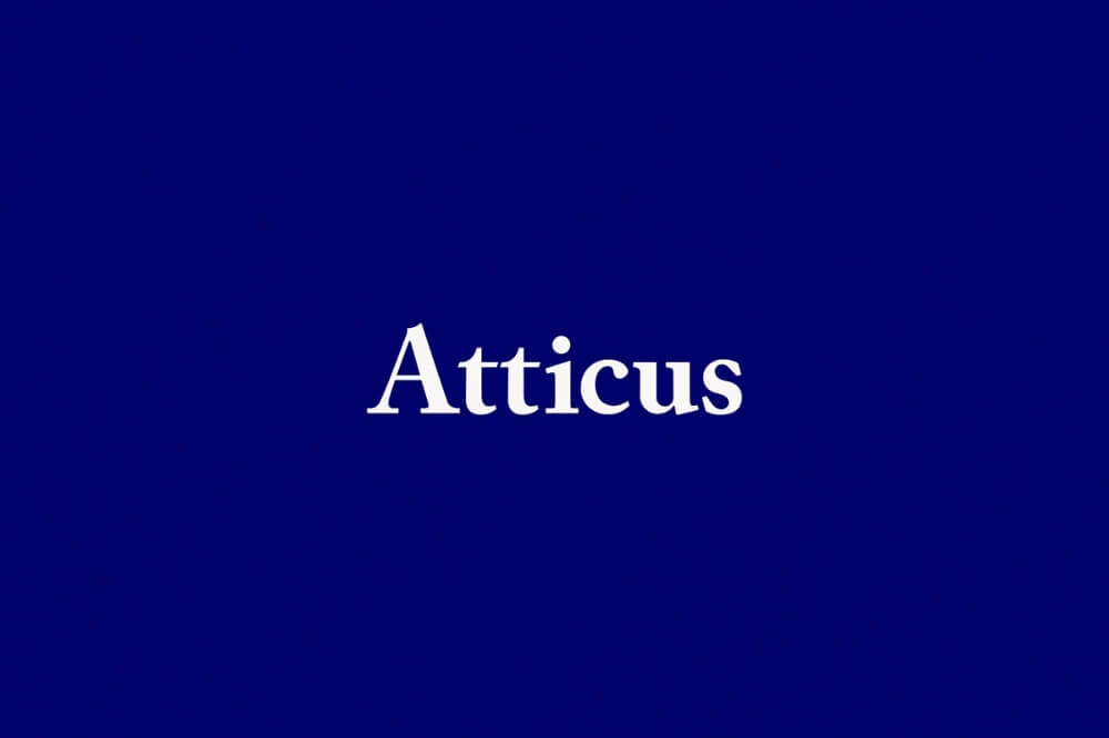
5. Atticus
Atticus Finch is probably one of the most famous lawyers in literature (and film), so it’s probably a law firm name that most non-lawyers can recognize and appreciate.
This legal consultancy gives free consultations and connects clients with attorneys or law firms that are best suited to their case. Because of its unique approach to law services, the company opted for a unique and less rigid brand identity.
Their website features numerous illustrations, however the logo designers opted for a more classic approach with this clean serif typeface.
6. Galicia Abogados
If you want to add some interest to a simple wordmark you can always consider combining two typefaces and use them for your company name and tagline.
Galicia Abogados is a good example as the name of the law firm is written in a legible typeface, while the word "lawyers" (or abogados in Spanish) is written in a humanistic script font.

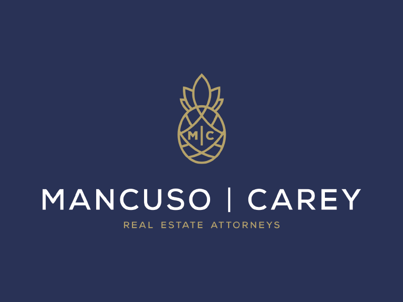
7. Mancuso Carey
Mancuso Carey are real estate attorneys, with a simple and timeless wordmark for their firm branding.
However, the graphic designer added a quirky and interesting detail by including an icon. It may represent a pine cone and since oak is one of the symbols of Connecticut where this law firm is located it's perfectly fitting. See how a small, place-specific detail can do more to distinguish a logo than a generic legal symbol ever could.
8. Jackson Philipps
If you happened to google creative business card ideas, you might have come across that famous divorce lawyer's business card that can be split in two.
This logotype created for a design contest follows the same elegant but powerful approach with two circles (or wedding rings). Since a portion of one of the rings is missing, it's a quiet reminder of what was once whole. The concept is understated, which is exactly right for this practice area: a divorce firm that leads with aggression in its branding risks alienating clients who are already navigating something painful. Restraint, here, is the point.

Scales of justice and other legal symbols
There are a couple of items that are universally recognized as symbols for legal service professionals: scales of justice, court pillars and gavels. However, symbols like books, pens, or the blindfolded goddess of justice can be equally appropriate for legal logos.
9. Furquims e Jensen
While scales of justice are without any doubt a good choice for lawyer logo design, it's important to remember that this symbol is used a lot. That's why this graphic design is so creative, as it combines the Furquims e Jensen monogram with the scales' plates.

10. Armando Vela Legal Firm
This artistic logo includes a building (probably a courthouse) and scales of justice paired with a bold typeface. The combination works because neither element alone carries the same authority. The building grounds the logo in institutional legitimacy; the scales connect it to justice specifically. The bold typeface ensures readability at small sizes, whether on letterheads, business cards, or a website header.

11. Michael Wilson
If you want to add an interesting twist to common legal symbols, you can always combine several design elements to create something new. This great attorney logo combines pillars (which often signify courts), a book (perhaps a symbol of the law) and the lawyer's monogram.

12. Barbara Cleto de Carvahlo Baldez
Another famous legal symbol often used is the Greco-Roman goddess of justice. She is easily recognized by the blindfold on her eyes. Although you might think a striking character like that might make law firm logo design inappropriate, this example shows how simplifying this design element can deliver a great impact.
The minimalist line treatment strips the symbol to its essential silhouette. A detailed illustration would fail at small sizes, but this abstracted version works equally well as a favicon, a letterhead seal, or a sign. That versatility is worth a lot.

Edgy and modern law firm logos
If you want to exude a sense of tradition, a classic crest or emblem logo is probably a good option. Still, modern law firms need contemporary logo design to attract potential clients.
13. Grodecki Rybacki and Partners
This Polish law firm has a very modern and sleek logo, along with an elegant monochrome color palette. The strict monochrome palette and geometric letterforms communicate precision and rigor. What makes this distinctive is what it leaves out: there's no legal symbol in sight. The identity stands on pure typographic confidence, which reads as a firm that doesn't need to borrow credibility from traditional legal iconography. It could easily make a great financial logo, but as a law firm logo it signals something more progressive.

14. Martha Athanasopoulou
This great modern logo was developed for a lawyer based in Piraeus, Greece. It combines Martha's monogram with a modern take on the traditional scales of justice symbol. The color scheme of this personal brand identity is also great, as it contrasts an elegant dark blue with matte gold.
15. Eugenia Canepa
This commercial and civil law lawyer logo is a combination of the attorney’s monogram and a Roman pillar. The logo design is simple yet modern and would make a great seal, or fit perfectly on stationery or letterheads.

16. Henn Haworth Cummings and Page
Many law firm names are made up of the partners' last names. A creative logotype design might mean including all these names and initials without making the final result too busy or cluttered.
This law firm logo design is a great example of how to do that right. The simple rectangles represent the first letters and make for a very clever design. The designer also chose a crisp, web-safe font, so that this relatively long wordmark can look great on smaller spaces like a website or social media.

Creative legal logos
Creating your own logo requires creativity and vision. The most original and memorable logos definitely don’t come from online logo makers; there’s usually a story behind them. If you put a lot of effort into it, it’s also a good idea to trademark your logo.
17. Ozarks Family Law
Generic legal symbols are something you can get even with free logo templates, but creating something that fits perfectly with your practice area will require a little more effort and creativity.
Ozarks Family Law logo is the winner of a design contest and it utilizes symbols that are not overused in the legal world. A tree might be representative of the family tree (suitable for a family law practice), while the owl represents wisdom and tact, which are necessary for these delicate affairs, unlike the ruthless negotiation style of corporate law.

18. Dunne Law PLLC
Including the year your legal practice was founded is a good way to give your logo some gravitas (especially if you've been around for a while). This design idea is also a good reminder of the importance of color theory, that is how to pair colors effectively. So, even a color like pink can have its place in a very stern, professional context if used correctly.
The pink works here specifically because it's held in check by a structured typeface and the founding year. The year adds gravitas; the structured type adds authority. Together they give the pink room to read as confidence rather than casualness.

19. Rafal Gondzio
An important part of creating the perfect attorney logo is thinking about your target clients. Rafal Gondzio specializes in advising content creators and influencers, a good example of how to cater to a specific target audience.
He needed a logo that was modern and appealing to his tech-savvy, trendy clients. This cool and colorful logo is a perfect blend of hip and professional, and makes an excellent personal branding project.

20. H&C Advogados Associados
Animal pictograms are common in food and drink industries but seldom seen with legal services. However, this professional logo shows that pictograms can be a good and suitable choice.
The dove is a symbol of peace or sending messages. So it can be a great choice for family law practitioners as a way to symbolize the importance of communication and restoring peace.

FAQs about law firm logo design
Need a logo for your law firm?
We hope this list of the best law firm logos gives you plenty of food for thought for your own.
If you have a concept in mind, we can help. ManyPixels is a top on-demand design service with over 6 years of experience and a team of vetted designers who specialize in brand identity work. We've helped firms create logos, brand guidelines, and full visual identities that hold up across print, digital, and everything in between. Learn more about our graphic design services for law firms.
Best of all - for as little as $699 you can get a new logo, complete with a branding identity and even a website!
Get started today and get the best law firm logo to put your business ahead of the competition! Or book a free consultation to see how we can help.

Having lived and studied in London and Berlin, I'm back in native Serbia, working remotely and writing short stories and plays in my free time. With previous experience in the nonprofit sector, I'm currently writing about the universal language of good graphic design. I make mix CDs and my playlists are almost exclusively 1960s.

Top-quality designers
A complete creative team at your fingertips: graphic and web designers, illustrators, and more.

Lightning-fast turnaround
Get start today and receive your first update on the next business day.

All-inclusive pricing
Unlimited requests and revisions. One flat monthly fee. No surprises.

Flexible & scalable model
No contract. Scale up and down as needed. Pause or cancel at anytime.
Continue reading


Explore some of our best designs
Get inspired by a curated selection of ManyPixels work. Download the portfolio to see what our team can create.


