

13 Mouthwatering Pizza Logos for a Great Pizzeria
Get inspiration for your pizza place logo design, with these examples of logos, sorted into Illustrations, Typographic, Negative Space, Modern and Traditional.

.svg)
Table of Contents

Are you searching the market for a logo to represent your local pizza shop and get the word out about your delicious recipe? If so, keep reading to stock up on inspiration for the best pizza logos (and prepare to crave some pizza after).
All business owners starting their own eatery or pizza delivery service in today’s digital age will know the importance of nailing the marketing to attract new customers and build a customer base. A high-quality pizza logo to advertising is like an airy dough to pizza—the ingredients are nothing without it.
Think about what aspect of your pizza restaurant you want to focus on and emphasize. Whether it be the speediness of the preparation, the impeccable taste of your pizza slice, the historical value of the recipe, or the authentic taste of Italy, having your graphic designer embed that into the logo design will be key.
Take a look at some of the best logo designs we’ve compiled that do just that while you cook up the logo ideas.
{{LOGOS_PORTFOLIO="/dev/components"}}
Illustrations
Illustrations help to attract the attention of passersby and give a larger canvas for design creation. Having a highly visual logo design is a great way to convey exactly what you wish about your pizzeria as well as make it stand out among the other competitors.
1. Poca Pizzeria
This Barcelona-based pizzeria logo uses a simple line free-flowing hand illustration to create the outline of a cheesy pizza. This minimalistic design highlights the most important aspects of pizza (its cheesiness), while also incorporating the stylistic element of Barcelona’s biggest influences in art—Pablo Picasso. The alliteration of the pizzeria name aligns with the alliteration of the art maestro, making this logo a true homage to great pizza as well as the nation’s pride and culture. Those who are art enthusiasts will appreciate and spot the resemblance from a mile away.
2. Atlas Pizzeria
Staying in line with appreciating cultural heritage in logo design, this next entry utilizes the famous New York statue with the Greek Titan Atlas carrying the heavens to represent the heavenly taste of this pizza restaurant. Using famous landmarks or statues in logo design can go a long way as it carries lots of meaning without having to add much to the logo, avoiding unnecessary clutter.
It is also a great option for those restaurants located in the vicinity of such landmarks, as it is made easier for customers to remember the name of the establishment and associate it with that area.
The logo design itself is very clean and modern, using only a few colors with the crimson red of the pizza being the star of the show. Mirroring the simple yet decadent taste of the pizza, perhaps?
3. Napoleon Pizzeria
This wonderful Paris-based pizzeria logo design combines a portrait of Napoleon with pizza, which serves as a replacement for his famous hat. The beige background which vaguely resembles dough makes for a great canvas for the colorful design elements to garnish it. The dark green color of the Napoleon logo as well as the red which is used to spell out the name of the pizzeria are all colors that can be found on a pizza, making the design one big pizza in itself. The random and slightly messy nature of the design, such as the yellow splash on the logo as well as the randomized curved lines give it a fun and playful look. The smaller pin designs give this pizzeria great brand identity, as these can be used as part of merchandising in the form of decorative pins, cutouts, etc.

Typographic logos
Typography is another tool that can be played with to create a great logo, as different fonts have very different characteristics which can be transferred to your pizza establishment. Whether a fun script font, a modern and classic sans serif font, the right font can fully transform your logo design.
4. Da Villa
This fun pizza logo features natural food-toned colors, mainly smoky black and olive, yellow, red and orange, to represent the ingredients used for pizza: basil, cheese, chili. The toned-down colors also give the impression that the quality of the ingredients used for making the pizza is on the forefront priority list for this pizza restaurant. Different shapes and sizes of pizza slices are used to make up the letters of the pizzeria name, giving the logo a unique and eye-catching look.

5. Aleo Pizza Point
Another great example of a pizzeria with great brand identity, Aleo Pizza Point uses two shapes that pizza comes in—triangle and square—to replace two letters “A” and “O” in their name. This trend, however, is repeated in all of their materials, including the menu, posters and business cards. As this small tweak is highly transferable, although at first glance it can be simple when used throughout the entire pizzeria its effect is maximized. This simple logo design is great yet simple enough to transfer onto multiple mediums, including business cards, social media and more.
Using negative space
The use of negative space is a common practice in design, for the reason that it creates beautiful and intriguing visuals. Using this less-is-more technique in pizza logo design is a great way to subconsciously signal to customers that the negative space in their stomachs can only be filled by your pizza.
6. Combo Pizza
This muted pink logo (a trendy color in design this year) is a great example of a more modern and flat pizzeria logo for a more hipster pizza place. Although simple, the letter C in the shape of a pizza on the left is quite intricate, with the endings of the letter creating pepperoni pieces within the pizza slice. These techniques create a clean and stylish-looking logo, leaving it up to the imagination what kind of pizza to expect from such a trendy place.
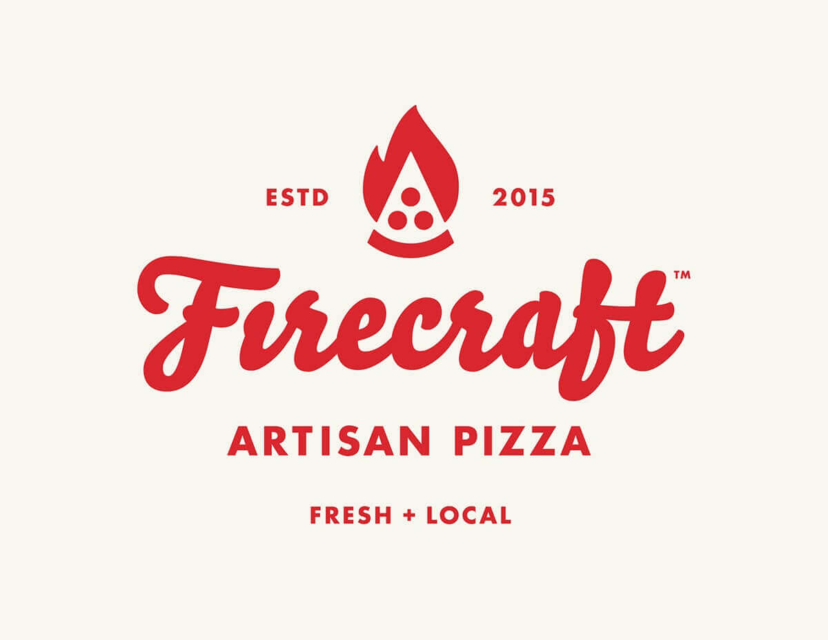
7. Firecraft Artisan Pizza
This artisan pizza restaurant custom logo is yet another simple design that uses the negative space inside the fire flame to create the outline of a slice of pizza (while slightly resembling a watermelon). The red color is bold and vibrant which attracts attention, while the white flame stands out against it, creating nice contrast. The color choice and the simple flame outline perfectly summarize the name of the pizzeria, making it an excellent exemplar that less is in fact more. The bold script font gives the logo a signature feel, mirroring a pizza of bold taste.
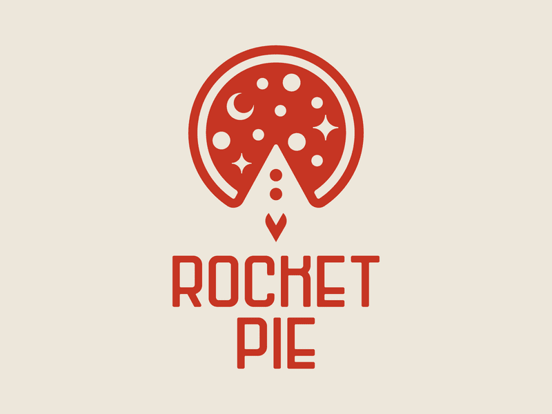
8. Rocket Pie
This next pizza restaurant logo makes use of the missing pizza slice to create an illusion of a rocket getting close to the moon. The sci-fi typeface compliments well the name of the pizza restaurant, giving it an out-of-this-world feel. The stars and moon drawn inside the pizza interior represent the galaxy of flavors that will fill the mouths of customers as they dig into their meal. The simplicity as well as the quirky nature of the font will make this logo look great on a pizza box.
Modern
As seen in the previous examples, there is a certain go-to array of colors as well as a number of specific design elements that pizza business logo designers tend to gravitate towards. And there is a reason for that—they work. Venturing out beyond that and trying out a more modern-looking design, however, can make your logo stand out and give it that wow factor. It can also be a great option for pizza restaurants that focus on a specific kind of pizza or a unique preparation method, which can be transferred into the logo design.
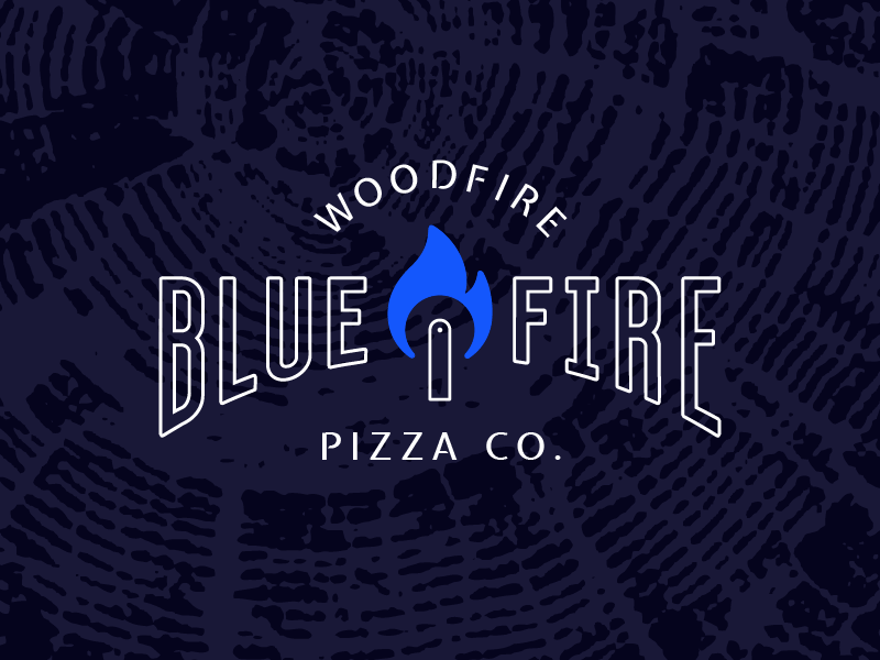
9. Bluefire Pizza Co.
To keep in line with the pizzeria name, this logo uses blue as the main accent color, which is certainly out of the norm yet works wonders for the design. Wood and fire elements are used to highlight the preparation method of the pizza—baking it in a wood-fired oven as opposed to a gas one. This preparation method adds a unique flavor to the pizza and is highly popular among some consumers, and hence advertising this in the logo is a great way to let customers know what they can expect. A great logo for a hipster pizza joint, this design is not only informative but pretty on the eyes.
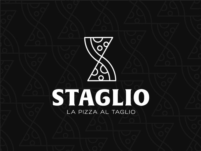
10. Staglio
This black and white logo manages to capture the Italian spirit while maintaining elegance and simplicity. It boasts amazing composition by stacking two pizza slices to form the letter “S” from their name. “La Pizza Al Taglio” translates as pizza by the slice, explaining why the designer chose to use pizza slices as opposed to the entire pizza, highlighting their business model. The faded shape of the pizza “S” in the background gives more dimension to the design. The round nature of the font used to spell out the Italian restaurant’s name is reminiscent of the shape of pasta, giving the overall design the continental feel.
11. Vesuvia
An example of a logo that puts heavy emphasis on speed, this design makes use of strings of cheese to represent the briskness with which the pizzas are delivered to the customer’s house. The name of the joint also represents the specific type of pizza that is prepared traditionally in the city of Naples, close to the volcano Vesuvio. As seen on the right side of the image, this design is a great option for a pizza delivery app logo.

Traditional
Tradition, specifically in the world of pizza making, is sacred, as the history of the art of making pizza dates back to the 18th century. While newly appearing pizza restaurants will keep appearing, there is nothing that can replace a good traditional pizzeria with generations of pizza craftsmen who can breathe expertise and history into the dough. If you are a long-standing pizzeria owner looking to revamp your business identity while maintaining the focus on tradition, here are some great examples to inspire you.
12. Marin’s Rustic Pizza
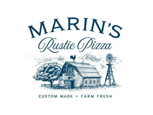
The use of an old-school textured illustration depicting a farmhouse in this logo does two things—it adds a vintage feel as well as reiterates the farm-fresh quality of ingredients used for making the pizza. The classic fonts tie the design together, making the customer feel as if the pizza is coming right out of their own oven. The faded color of the image also gives the design a mature and classic look.
13. Piesmith Pizza
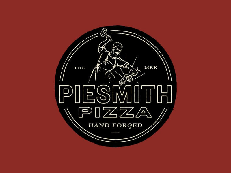
Baking a good pizza pie requires a lot of hard work, just like a coppersmith would use his decades of knowledge to form the best shape out of metal. This logo uses that concept to ensure the customer that every single pizza made here is well taken care of. The design uses an old school illustration paired with rough shapes and textures which adds dimension to the logo as well as a beautiful artisan look, which is paired well with the pizza-smith’s moustache.
Feeling inspired but don’t know where to start? While a logo maker or a pizza logo design template might do the trick, if you wish for your logo design to truly convey the top-notch quality of your pizza, we suggest hiring a graphic designer to make a custom logo to capture every element of your pizzeria. Check out our monthly plan which can get you your own graphic designer at a fixed price with unlimited design requests.
Found my calling in the online world writing articles about design. Russian by passport, Korean at heart. Dreaming of traveling the world and spreading love.
A design solution you will love
Fast & Reliable
Fixed Monthly Rate
Flexible & Scalable
Pro Designers


