
21 Vintage Logo Design Ideas That Will Always Be in Style
Learn about vintage logo design with great examples, sorted into 4 categories: Emblems, Retro Mascots, Hip Lettering and Vintage Illustrations.

.svg)
Table of Contents

Retro logos and different vintage design styles are still prevalent and definitely present. If you’re considering making your own vintage logo, take a look at these examples.
Retro or vintage might seem like an overused word, that definitely seems to change its definition as new styles pop up. For me, retro means Victorian, or 60s and 70s hipster, all the way to 80s and 90s nostalgia. But no matter the design style you think of when you try to come up with your definition of vintage, some styles always make the final draft.
There are plenty of vintage logo makers online that can imitate the style. But vintage logo templates and generators can’t infuse a retro style and give it a custom look that is perfectly tied to the brand story.
To begin with making your own logo, first, you need to study some good examples. From Art Deco to cartoonish mascots, you’ll see plenty of vintage in these selections.
{{BRAND_BANNER="/dev/components"}}
Emblems and badges
Emblem logos are the first type of logos to exist together with royal monograms and sigils. Now, they are a show of elegance, class and a tad bit of hipster aesthetic. You can see them anywhere these days, from the corporate looks of real estate companies, to hip barber shops. Here are some good ones.
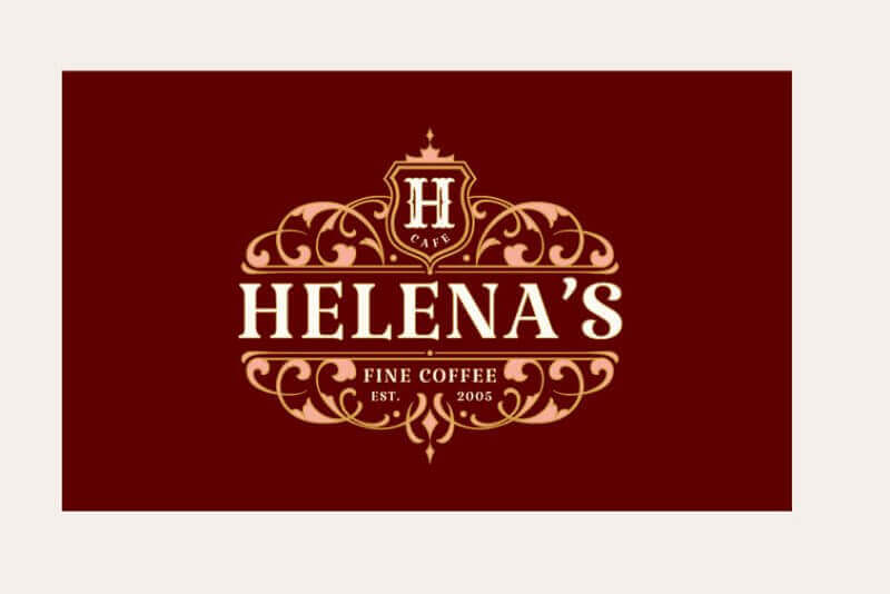
1. Helena’s Fine Coffee
This classy Victorian-style vintage logo design employs all the best characteristics of the style’s elegance: a beautiful frame, serif typography, and a lavish color palette.
2. Press Waffles
This retro style signage for a waffle and coffee shop is elegant and teleports you to another time and place. The 18th century-style and Victorian typeface make it unique in today’s times, even though it might have been very regular back in the day.
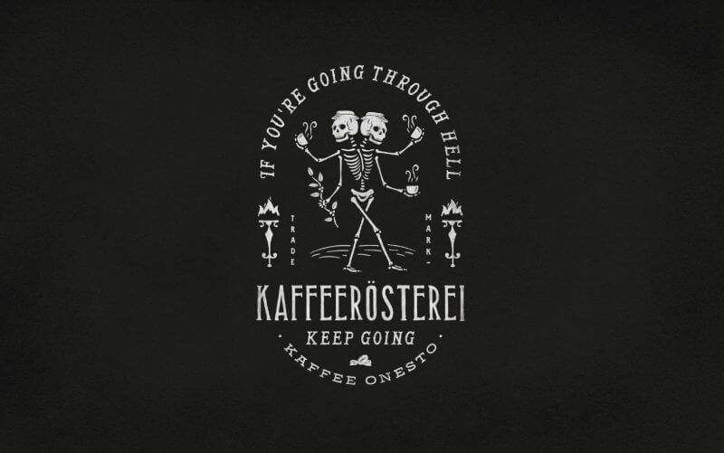
3. Kaffeerosterei
This quirky and unique logo takes inspiration from the macabre and comically dark illustration styles of the Dark ages, framing the business name in the slogan “If you’re going through hell, keep going”. Exactly what you want to hear from your coffee supplier when you’re having a rough day! All in all, it’s a great example of coffee shop branding.
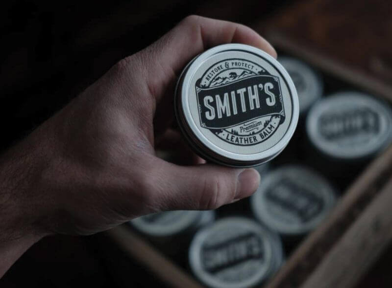
4. Smith’s Leather Balm
Here we have yet another vintage style emblem, that uses a sans serif font and additional illustrative elements. It makes a cool badge logo that is definitely applicable in different packaging materials.
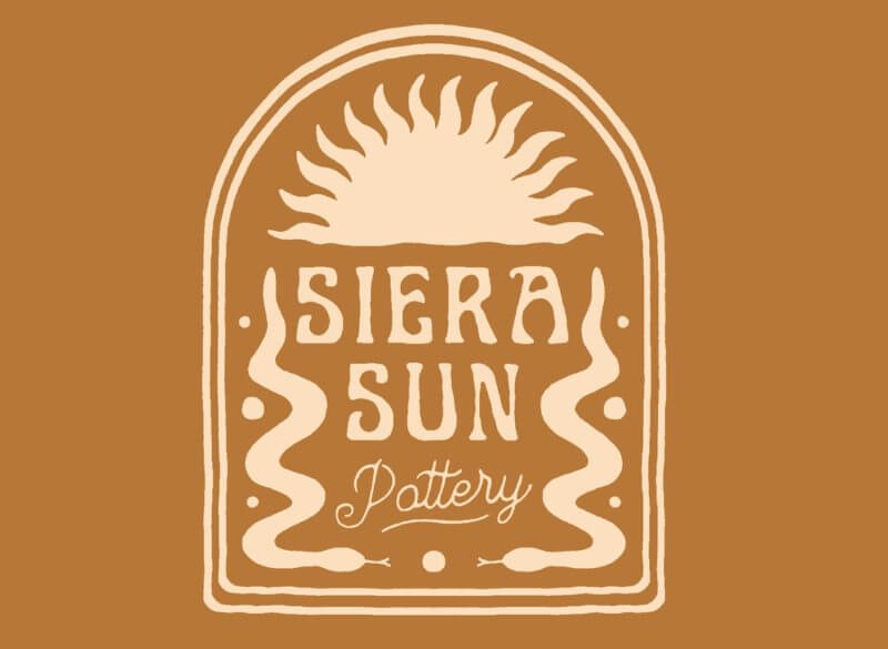
5. Siera Sun Pottery
Instead of vintage Victorian, the Siera Sun Pottery badge logo is in the style of the late 20th century, with a hip and quirky hand-lettering and interesting watercolor style illustrations. The terracotta and white color palette is as suitable as can be for a pottery shop.
Retro mascots
All over the world, but most prominently in the US, in the 50s and 60s mascots were a very common logo design style. Especially in the food industry, adding a character to the brand story really helps with memorability and reliability. Mascots today are seen to be retro, especially in the cartoonish style.
6. The Smoking Mayor
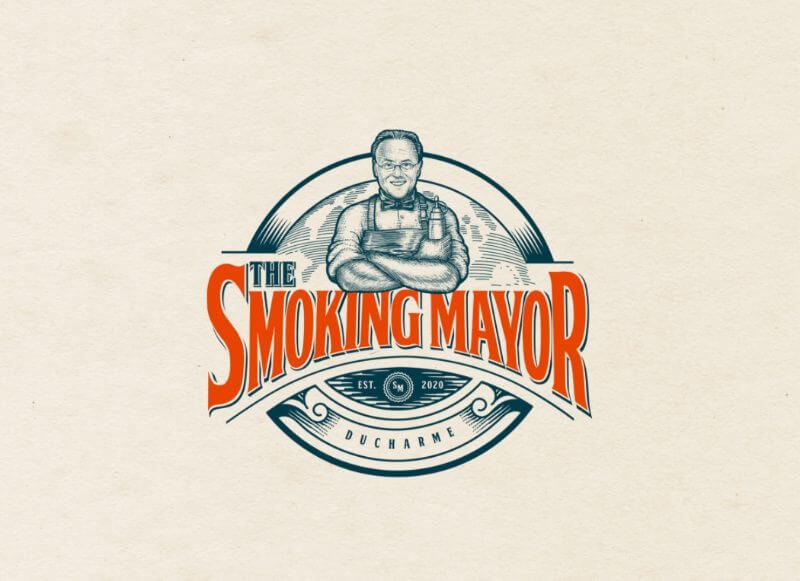
This mascot logo for a brand of barbeque sauces shows the portrait of the mastermind behind the blends, in an old school ink illustration style. The chef was also a former mayor of Gatineau, Canada, hence the name and brand identity are based on that title.
7. Altice Optimum
This cool logo shows that an unusual style in logo design can still be high-quality, even though it is cartoonish. With the slight resemblance to pop art and textured typography, it is a testament to the skills of the professional designer behind it.
8. Patience Sweet
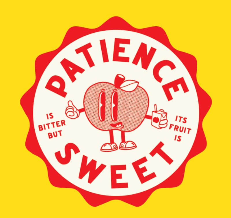
This logo concept is cute, cartoonish and well-illustrated, so much so that I’d easily imagine it as a sticker design or on a nice t-shirt.
9. Pizzettina Fischiettina
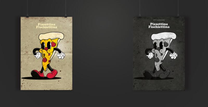
This concept for a pizzeria is inspired by the 30s cartoon style, and the graphic designer imagined it as a slice of pizza walking down the street and whistling.
Hip lettering
Whereas today we see a lot of decorative ovary stripped-down typography, back in the day there was plenty of hand lettering in 3D style, groovy and flowy serifs, as well as bulky and blocky typography. Think of the Summer of Love, album covers in the 60s and old neon signs. Luckily, some of these styles still exist today and make for a great font choice for logo design too.
10. That Good Good
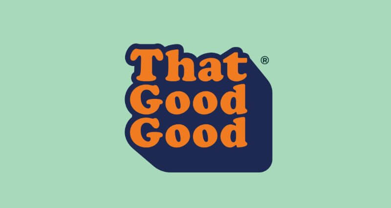
This lovely 3D style wordmark is created for a plant-based cafe. The bulky serif font and the bright colors give it a youthful charm, but the overall simplicity shows that graphic design doesn’t have to be excessively detailed to be good.
11. Rohan’s Illustration
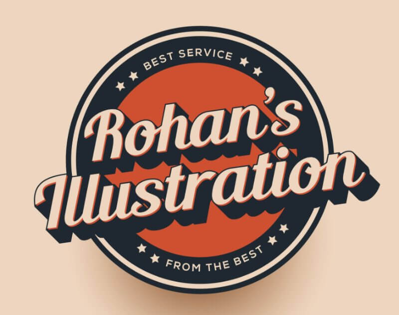
This personal logo for illustrator and graphic designer Rohan Rafi is a cool retro emblem with a 3D typeface and bold use of color.
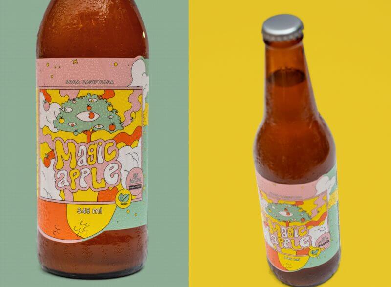
12. Magic Apple
This psychedelic-inspired typeface is a great font choice for this packaging for a carbonated soda. It is youthful and groovy, and even though there is a lot going on with the letters and illustrations, the pastel color palette tones it down, and ties everything together.
13. Hot Plate Records
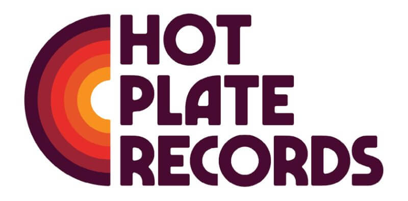
This cool design for a record company is a perfect solution, especially because it seems to draw inspiration from the golden days of rock and roll. The simple color palette and quirky typeface are perfectly versatile and applicable on anything, from record sleeves to business cards, from social media to stationery design.
14. Revolution Roasters
These two logo solutions were created for Revolution Roasters, a ‘groovy coffee truck that serves out of a 70s Volkswagen’. The logo is inspired by the playful, bold, and curvy type that is often tied with the 70s and the hippie culture. In both designs, you can see a coffee bean shape smuggled in the letter ‘O’ or the whole logo design.

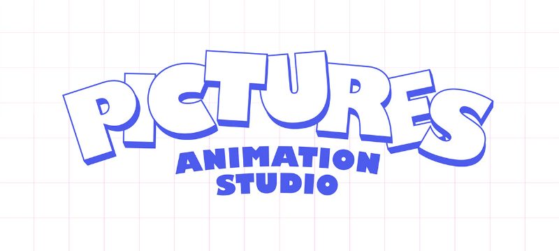
15. Pictures Animation Studio
Ah, the good all days of quality content on Cartoon Network… Those are the memories this logo brings. I immediately think of Animaniacs, Pinky and Brain, and other classics.
Vintage illustrations
Finally, no vintage logo design list is complete without good illustrations. The specific ink-style drawings or watercolor illustrations, as well as imitations of popular art styles of the past fit into this subcategory. Check out these unique business logos, that no free logo maker can nail as good as a custom designer could.
16. Verusart concept
This unused concept includes an ink-style illustration of a bird and luscious serif typography. The style of drawing and decorative lettering makes for a fancy take on a rather common object in design.

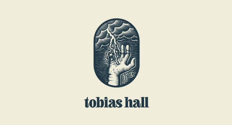
17. Tobias Hall
The second personal logo example in this list belongs to professional designer and illustrator Tobias Hall, who created a custom flowy typeface and an epic and almost mythical illustration.
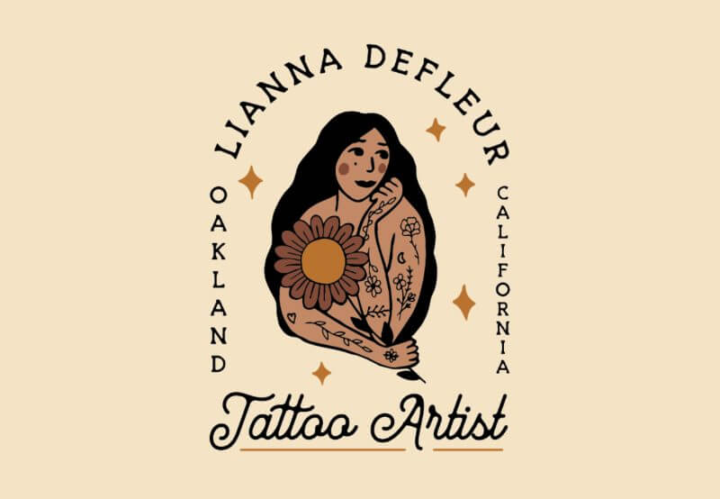
18. Lianna Defleur
This unique logo for a tattoo artist in Oakland perfectly marries the Art Nouveau style with a contemporary portrait illustration, presumably of the artist herself. Everything, from the script typography to the secondary serif font and additional elements, are both elegant and resembling a tattoo style.
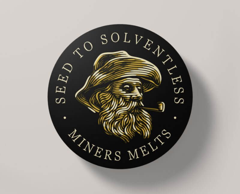
19. Miners Melts
This vintage illustration successfully imitates the style and brush strokes famously used by Vincent Van Gogh, known as impasto. In impasto, there is a thick layer of paint, and the brushstrokes are clearly seen due to the large depth. This logo, although digitally created, perfectly imitates that look.
20. Women’s Moto Exhibit
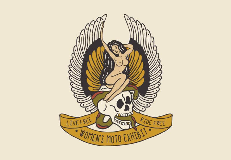
This logo created for an apparel line fuses Americana and poke style tattoo illustrations, as well as the classic look of the Harley Davidson logo.
21. Maine
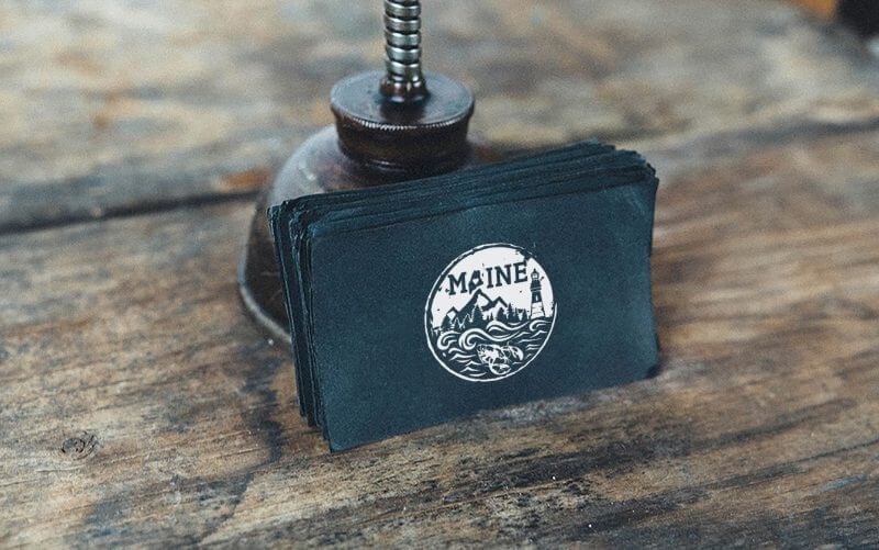
The final logo on our list is a concept that reflects all the things that Maine is famous for, in a cool watercolor style illustration.
Journalist turned content writer. Based in North Macedonia, aiming to be a digital nomad. Always loved to write, and found my perfect job writing about graphic design, art and creativity. A self-proclaimed film connoisseur, cook and nerd in disguise.
A design solution you will love
Fast & Reliable
Fixed Monthly Rate
Flexible & Scalable
Pro Designers


