Tips and Tricks to Create a Facebook Ad Design That Sells
TABLE OF CONTENTS

You spent a lot of time finessing your Facebook ad design and launched your campaign. And then? Crickets. No replies, no likes, no clicks. Here are 14 tips that will teach you how to design effective Facebook ads.
{{SOCIAL_BANNER="/dev/components"}}
1. Choose the right format
Before jumping into the nitty-gritty of how to design Facebook ads, you need to decide which format you’re using.
Currently, Facebook has eight main ad formats and several variations to them.
- Photo - The most basic format, where you have a single image and a short header.
- Video - Similar to the photo format, but instead showcasing a video.
- Stories - Stories immerse viewers in a full-screen experience, which gives you the option to attract their undivided attention.
- Messenger - An ad sent straight to your customer's inbox via Messenger.
- Carousel - With a carousel campaign, it’s possible to showcase up to 10 individual images or videos.
- Slideshow - Show a slideshow of images with the added option of background music.
- Collection - With this format, you can show off a collection of images in a virtual display case.
- Playables - Interactive ads let people play a game or use a program before downloading it.
2. Size matters
Once you have decided on one of the formats, it’s crucial to design according to that format. Each format comes with different specifications in sizing, layout, character and duration limits (for video ads).
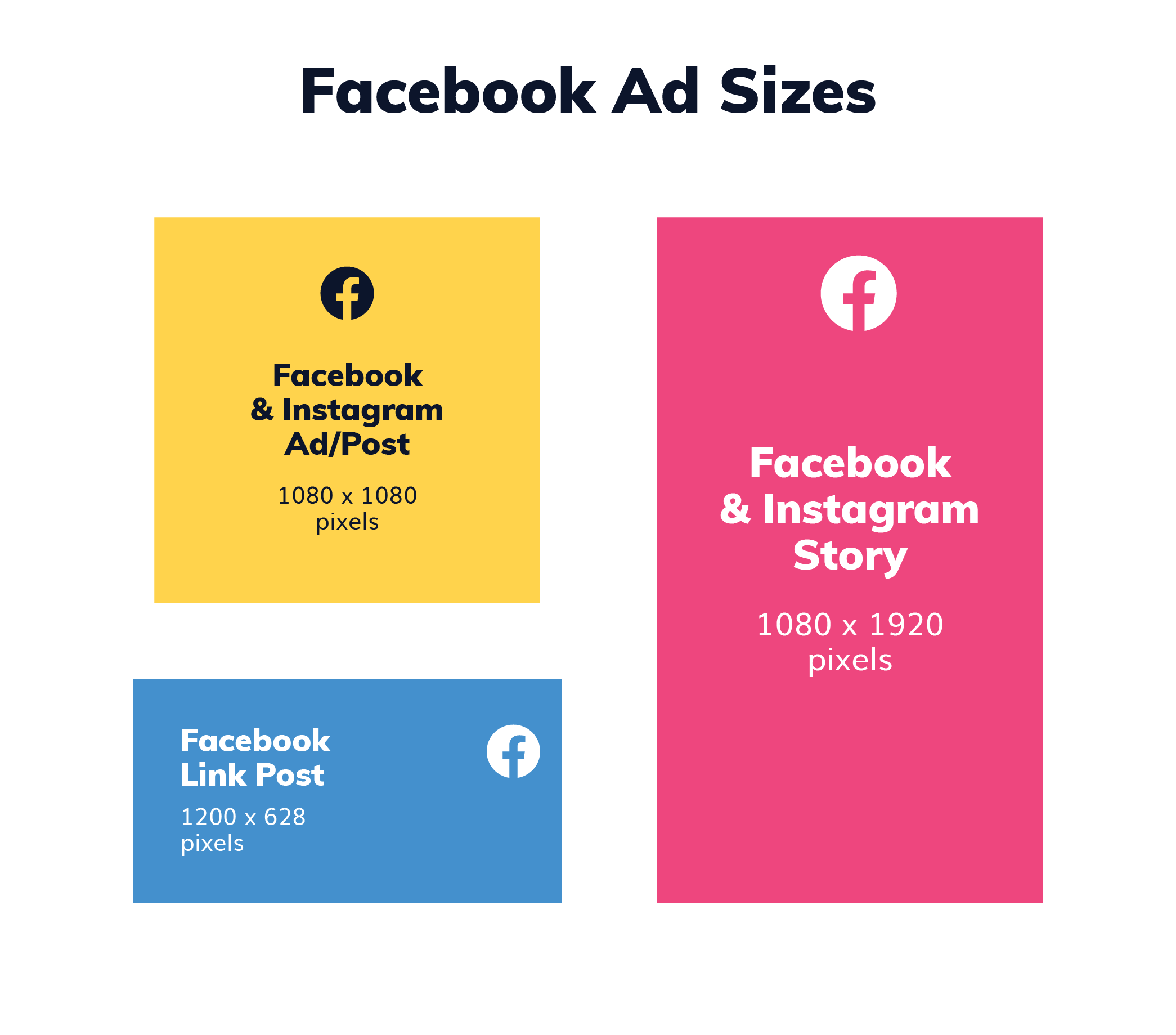
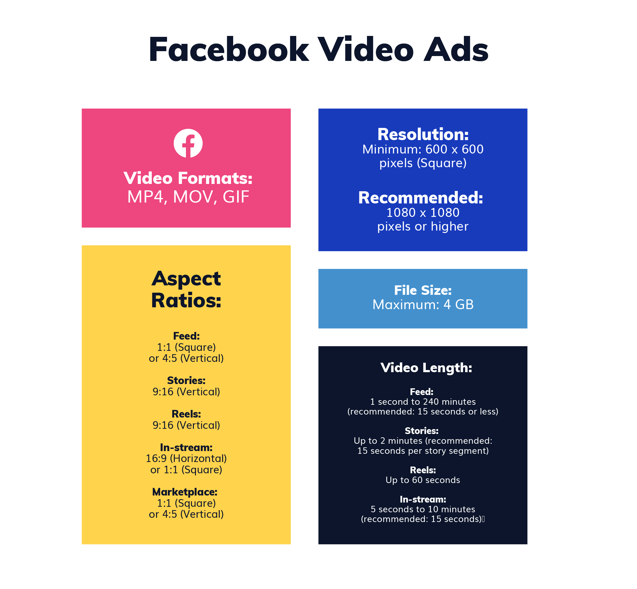
Of course you can also customize Facebook ad templates, if you want to ensure you’re using the right size and format.
3. Ad placement
Where your ads appear is another critical factor that will impact ad design. Facebook will automatically crop your ads to fit the recommended ratio. However, you can also customize and select images for each placement.
This is especially important if you’ve designed with only one type of ad in mind (e.g. the square Instagram format, but not the vertical Stories one).
4. Contrast is key
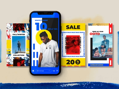
Contrast is the design element that can put you in the limelight on Facebooks’ repetitive newsfeed. Play around using contrasting colors and text to add visual interest to your ad.
5. Keep ad objective in mind
When you create a campaign in Facebook ads manager, you must choose an objective. There are 5 types: Traffic, Awareness, Engagement, Leads, App promotion and Sales.
So, your Facebook ad design should align with your marketing goals. For example, if you wish to boost sales, ad graphics should prominently display a promotional offer. If you want to increase brand awareness, you need to showcase your brand identity with messages that appeal to your target audience.
Your ad objectives also impact cost per click rates. If you’re using a video in an awareness campaign, you should pack key information in the first few seconds. This way you’ll make the most out of your ad spend.
6. Focus on your value proposition
Heavy text ads have minimal reach on Facebook. Don’t make the mistake of overcomplicating your message. Instead, keep your ad copy to the point, and use visual communication to convey your message.
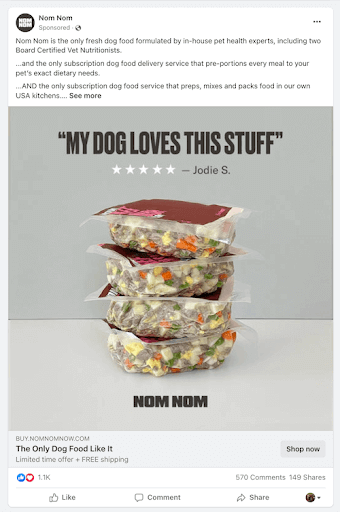
You can also minimize text by adding in wordplay, for example. Or you can rely on common symbols, simple icons to convey your message more quickly.
7. Evoke emotions
Even an ad targeted at a specific audience can sometimes fail. Why? Well, your audience sees dozens of similar ads daily, so it’s easy to overlook some of them. One surefire way to avoid that is emotional marketing.
Coca Cola is a great example of pairing ad copy with heart-warming visuals like this.

8. Motion graphics are in
Did you know that instead of uploading an image, you can upload a GIF? These fun, short animations are a creative way to grab the attention of your audience. Bonus points if you design one yourself, specifically for your brand.
Motion graphics are also a fantastic, inexpensive alternative to videos. If you don’t have professional recording equipment and video editors, unlimited design services can offer motion graphics design for a flat monthly fee.
{{MOTION_BANNER="/dev/components"}}
9. Add videos
A video forces a scrolling user to stop and pay an extra second of attention before understanding what it’s about. This extra second in the digital age is considered an abundance of time; use it wisely and grab your audience's attention.
Bear in mind that users are 1.5X more likely to watch a Facebook video on mobile. So, you should ensure your videos are mobile optimized.
10. Storytelling
Storytelling is the act of showing different phases in your advertisement. People love a good story, so why not let your brand star in one?
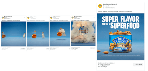
A carousel of images showing your product or service in different phases is excellent storytelling. It might be unpacking a physical product, or onboarding steps for digital products.
11. Show faces
Studies show that ads showing faces attracted 91.7% more attention than those without.
Showing faces in your ad means a lot more engagement. It’s where most of us look when we first meet a person, and it does the same thing for Facebook ad images.
Of course, you should be careful when choosing stock photos (in case you’re not using your own photos). Pick people that make sense for your brand. For example, if you’re advertising a modern SaaS solution, corporate-looking people won’t be the best choice.
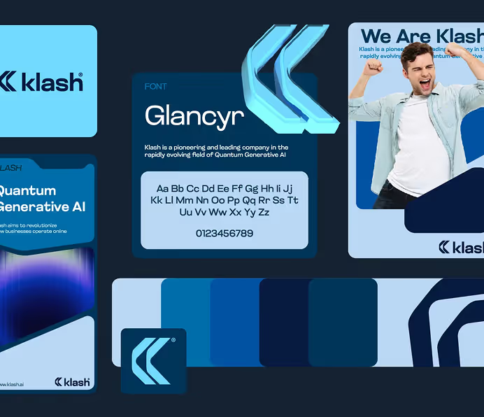
12. Create a branded look
Make sure that people instantly recognize your brand from the ads. Here are some tips on creating a branded look:
- Pick out one color from your logo and use it as an overlay on your images.
- Use the same typography for each visual element of your brand.
- Add a watermark on your social posts.
- Illustrate different elements and use them for each visual message.
- Your ad and landing page that it leads to should have the same design to ensure smooth user experience.
13. Use color psychology to your advantage
If you think any flashy color will grab attention, think again. Color psychology is a real thing and is worth looking into if you want to learn how to design Facebook ads.
Know that each color represents an emotion. For example, yellow describes optimism, and blue is a color of trust. Additionally, remember that some colors carry deep meanings with them, depending on the culture.
14. Hire a pro
When it comes to designing Facebook ads, you should know that this is a job on its own. We can give you all the Facebook advertising design tips in the world; it still doesn’t ensure good graphic design.
Sometimes, it’s best to leave it up to the professionals. Instead of spending precious hours nailing your design, you could hire a designer to do things for you.
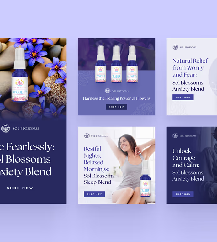
Traditional Facebook advertising agencies charge thousands of dollars for running your social media campaigns. However, you can also try our unlimited Facebook ad design service at a flat monthly rate.
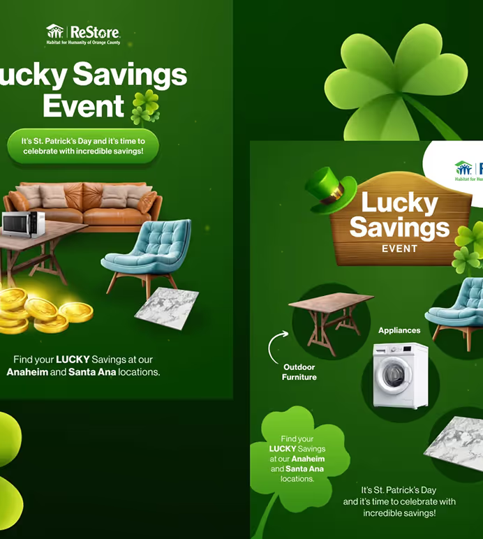
{{ADS_PORTFOLIO="/dev/components"}}
For as little as $549 ManyPixels can design your Facebook ads and and anything else you want to throw in the mix: landing pages, custom illustrations, presentations, and more! See how it works and get started today!
Still unsure? Book a free consultation with us, and we’ll be happy to discuss your design needs in more details.

Top-quality designers
A complete creative team at your fingertips: graphic and web designers, illustrators, and more.

Lightning-fast turnaround
Get start today and receive your first update on the next business day.

All-inclusive pricing
Unlimited requests and revisions. One flat monthly fee. No surprises.

Flexible & scalable model
No contract. Scale up and down as needed. Pause or cancel at anytime.

Continue reading
Explore some of our best designs
Get inspired by a curated selection of ManyPixels work. Download the portfolio to see what our team can create.








.jpg)