
15 Stunning Bakery Packaging Designs to Inspire Your Own
Looking to give your local bakery business a competitive edge? Delight customers with amazing bakery packaging design!

.svg)
Cute and useful bakery packaging design is part of the experience of buying bakery products, and this article is here to help you find inspiration for your own.
{{PRINT_PORTFOLIO="/dev/components"}}
1. Croissant Café & Bakery: Customization of simple paper bags
This bakery business uses not-too-fancy packaging supplies but manages to customize them and add visual appeal in an economically efficient way: by adding stickers to the kraft paper bags. It’s a great way to minimize printing and design costs, but still be authentic.

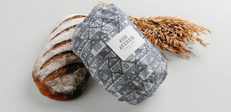
2. 45th Avenue: unique patterns
This extravagant and luscious branding for a bakery named 45th Avenue got equally elegant packaging designs. The Art Deco logo is applied on all assets, such as shopping bags, bakery boxes, as well as wrapping tissue paper for the bread.


3. Bakelove: using the most of simple materials
Quite often you’ll hear that the secret ingredient in good baking is love, and this bakery infused love not only in its products but in the branding design too. The cute bakery logo shows streaks of whey and a heart.


4. Dough Dealer: distinctive brand image
In the era of the DIY craze, people love using products that are supposed to be created by them but take away the harder steps. So, Dough Dealer is, in a way, the Ikea of bakeries.
Truthful to the brand image, the make-it-yourself kits are packed in unusual bags and bottles, some of which include recipes for making your own bread.


5. Lolli & Pops: rich packaging for rich sweets
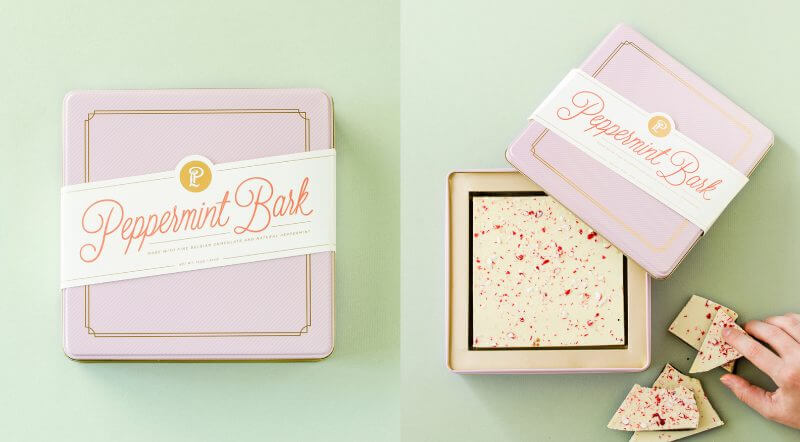
Although not just a bakery, but a retailer of specialty confections, sweets, chocolates and packaged treats from around the world, Lolli & Pops has packaging suitable for baked goods as well. The elegant macaron boxes and cookie boxes in gentle pastels make for a perfect sweet surprise.


6. Persephone: intricate illustrations
Rarely does a packaging design include so many hand-drawn, intricate illustrations, as does the Persephone bakery from Wyoming. Every drawing on this bakery packaging design looks like a work of art.


7. Brodflour: practical takeout containers
If your bakery (or your client’s bakery!) sells breakfast pastries or sandwiches, chances are customers buy them to eat them immediately. A very useful thing to do would be to turn your packaging into takeout containers that will be useful to them, so they don’t have to use extra dishes if they’re on the way.

8. Balloon & Whisk: the cutest bakery packaging you’ve seen
Yes, food packaging should be disposable. Still beautiful bakery packaging boxes like these can be used for products with a long shelf life, and even kept for different uses. So, you’ll end up with a more eco-friendly solution for your bakery packaging.


9. Joie Bread Co: modern and practical
The uplifting and fresh turquoise color is a nice base for all the packaging products, and the dark-brown coffee color is a perfect combination for it. The coffee cups are a creative idea for coffee shop branding since they have useful compartments for your donut to go!


10. Pie boxes: cute DIY packaging
These pie slice boxes by designer and artist Lia Griffith can be a great bakery packaging design idea. Using simple cardboard, she created an impressive and cute, as well as practical design. With the addition of an origami “whipped cream” and wavy-cut paper to visually create the crust, she created a truly artful design with simple packaging materials.

11. Galycky Strudel: traditional look for a traditional recipe
This bakery in Kyiv was based on an idea that values tradition and continuity in the identity of a city’s residents, and the ancient city of Lviv. Lviv’s famous families had their own monograms, seals and ornaments, and the designer infused these elements in the visual identity.

12. Moon Bakery: origami cake box designs with a deeper meaning
These cake boxes were created for the Mid–Autumn Festival, also known as Moon Festival or Mooncake Festival, celebrated by many nations in the East-Asian region. Every part of the cover represents a crescent moon and when the box is closed, the crescent moons create the full moon.


13. Dulce Emma: cupcake boxes stamped with love
Dulce Emma, that translates into Sweet Emma, uses cute boxes for their equally cute bakery items. The mascot logo featuring Sweet Emma is added with an old-school ink stamp.

14. Le Petite Patisserie Bakery: elegant and simple
These custom bakery boxes have a very elegant color scheme that makes for a stylist brand identity.The simple design fits equally well with pastry boxes as well as the humble paper bag for packing bread.


15. Navi: modern and minimal
A different approach will definitely help with brand recognition - just make sure it fit your brand identity. This minimalist brand design fits great on custom packaging, as well as a modern bakery website.

Final word
We hope you enjoyed this list of bakery packaging design ideas! Whether you’re looking for a cutest brand identity or eco conscious packaging that your customers will approve of - our team of designers can help!
Discover more about flat-rate design services here or book a call to learn more.
Looking to give your local bakery business a competitive edge? Delight customers with amazing bakery packaging design!
A design solution you will love
Fast & Reliable
Fixed Monthly Rate
Flexible & Scalable
Pro Designers


.jpg)
.jpg)
