

14 Plumbing Flyer Designs to Lock In Your Customer Base
If you’re looking for inspiration to create a well-designed flyer for your plumbing business, then check out our list of the 14 most creative examples.

.svg)
Table of Contents

Whether you are an already-established provider of plumbing services or a new plumbing business around the block, flyers are a great vessel to expand your customer pool. Here are 14 flyer design examples to inspire your business.
As opposed to social media, flyers are a great way to advertise businesses that are widespread and depend to a large extent on proximity to customers’ residential areas, such as cleaning services, electricians, repairmen and plumbing. Your business can greatly benefit from flyers because customers learn more from them about your services. If you don’t know how to begin making one, here are some ideas compiled into different categories.
{{PRINT_PORTFOLIO="/dev/components"}}
Minimalistic
While having a loud design to capture passersby’s attention is important, if overdone, it can end up looking tacky and unprofessional. As is the case with many things, oftentimes less is more. In the case of flyers, being selective with the information you choose to display shows that you know what your selling points are and that you are confident enough in your business to not have to dump every relevant piece of information on the A4-sized paper.
1. Plumbing service
This plumbing services flyer template uses three primary colors that interact well with each other. The blue is a standard color used in the business setting and conveys trustworthiness, while the yellow-orange adds a nice pop of color to spice up the design. It includes just enough information for a customer to know the services offered by the business, as well as the contact number. The “and we always leave the seat down” underneath the title is a nice touch adding comedic and personal value to the design.

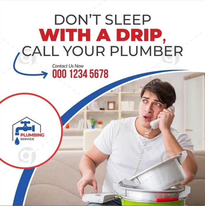
2. Don’t sleep with a drip
This plumbing flyer takes a comedic approach in attempts to convince the potential customer to use their services. The distressed facial expression of the man is one too many of us can relate to when trouble strikes at home. The call to “call your plumber” here acts as a sort of rescue, the one that will solve all your plumbing problems. And when desperate situations arise, that feeling of reassurance works better than any sort of fancy flyer design or discount incentive. The use of different plumbing fonts can also help deliver the right message.
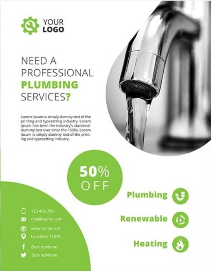
3. Lime green
This next flyer template is an example of great graphic design that uses just a few elements yet has a great effect. The light green color incorporated into the design evokes feelings of safety and reliability with the lime aspect adding some zing. The circle at the center of the flyer with the “50% off” text naturally captures the eye. The outline of the water tap image is made to resemble a water droplet—a nice touch that almost goes unnoticed at first glance yet does a great job of tying the entire poster design together.
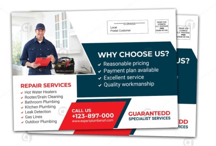
4. Repair services postcard
This postcard design can be transferred to various mediums, including flyers, business cards, or greeting cards. It also is made up of three main colors—red, blue and white—which compliment each other well and give the design a coherent and professional appearance. Although the size of the postcard itself is relatively small, all information that could possibly be needed is included.
Featuring people
There is a reason that using beautiful people in advertising works—seeing something beautiful makes us feel good, and that feeling extends onto the product, making us associate positive feelings with making the purchase. The right “look” of the person on a flyer can also transmit feelings of trustworthiness, credibility, positivity and more.
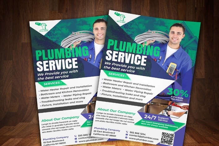
5. Plumbing service
This flyer design kills two birds with one stone, as it catches the eye not only with the vivid and bright purple and emerald colors but also with the portrait of a dapper man. While it’s highly questionable that a model-turned-plumber will pay a visit to your home, it’s the power of imagination that counts.
6. Blue
In the case of flyers, the louder the better. This flyer template demonstrates that well, as the blue rays add a sensational touch to the design, attracting attention. The presence of the man facing the front while jotting down something gives a measure of professionalism as well as certainty that the company takes into account the feedback and opinions of the customer.

7. Plumbing expert
It is a common understanding that we associate older people with wisdom and trust, as they have years of life experience to reap knowledge from. The following plumbing service flyer features an image of an older man behind a whiteboard—adding the element of education, an additional boost to the credibility of the services. The use of yellow as the accent color is used greatly here as it is a vivid color that captures attention, as well as elicits positive feelings.

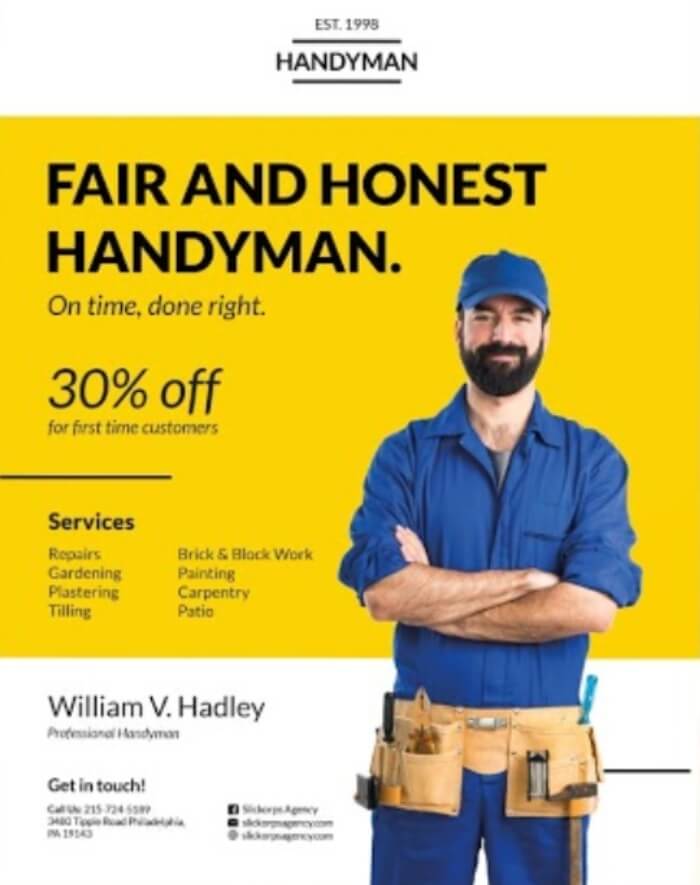
8. Fair and honest handyman
This next template is a handyman flyer design, depicting the portrait of the man at the forefront. The template has a personal feel as it features the handyman’s full name, as well as the words “fair” and “honest” in the title—two things you definitely want to associate with any business you give your money to, as it promotes the trustworthiness and reliability of the services. Honesty is also an important factor, as you would definitely want to know if there is a big problem in your pipes—no matter how upsetting that may be. The design itself is also very tidy and easy to skim through, which is equally as important as having an eye-catching design. Catching attention is the first step, but getting the information across to the potential customer is the main goal.
Double-sided/Tri-fold flyers
The beauty of a piece of paper is it has two sides, meaning double the space to advertise your plumbing services! Whether it is a tri-fold brochure or a double-sided flyer to hand out to passersby or put into mailboxes, this form of flyers is perfect for including extensive information about your services, enough to convince potential customers to pick your business out of the pool of available plumbing services.
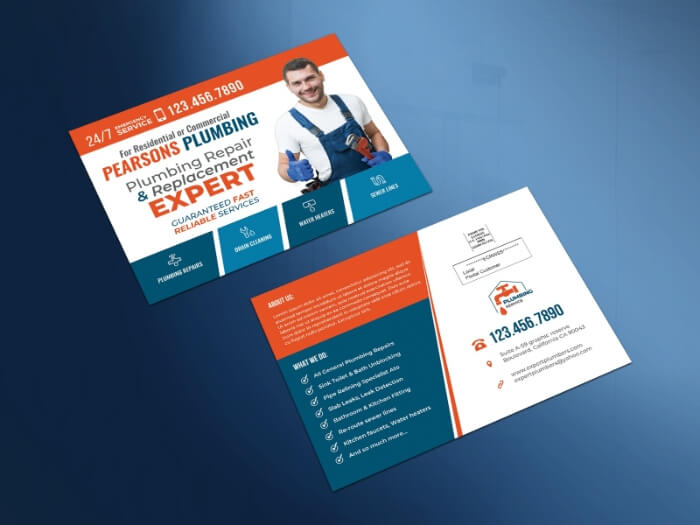
9. Double-sided flyer
This double-sided mail marketing postcard template is an excellent example of utilizing the extra space to provide all the information the customer would possibly need about the services you offer. The design is bright yet professional, with the front of the flyer featuring a photo of a happy plumber. The front side doesn’t feature nearly as much information as the backside, except the essentials—services provided by the company, contact information and time availability—to avoid any unnecessary clutter. The backside of the flyer, on the other hand, goes more in-depth, providing more information about the business in the “about us” section, giving a more detailed rundown of the services as well as the address of the company.
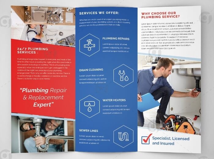
10. Tri-fold flyer
This editable photoshop tri-fold template is a great option in case you do not wish to spend any money on a designer, and it can also save a lot of time to get the finished product. The design provides a lot of visual aids with pictures, which is great in any form of marketing, as highly visual content is what often makes the greatest impression. The colors red, blue and white complement each other well, giving this brochure design a nice sleek look.
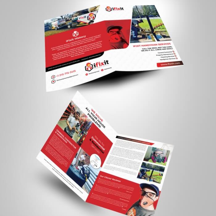
11. Booklet flyer
A booklet layout is another great option for advertising your plumbing business as it is easier to flip through than a tri-fold brochure, yet has two more pages than a double-sided flyer design. This elegant yet playful design works well on the eyes but also compactly fits in a lot of relevant information, including clients’ reviews.
Quirky/alternative
If done right, using a slightly alternative design for your plumbing services can do wonders to help your company stand out and catch the attention of customers, among other more generic flyer designs. Here are some fun and funky designs to help your company stand out.
12. Orange and red flyer
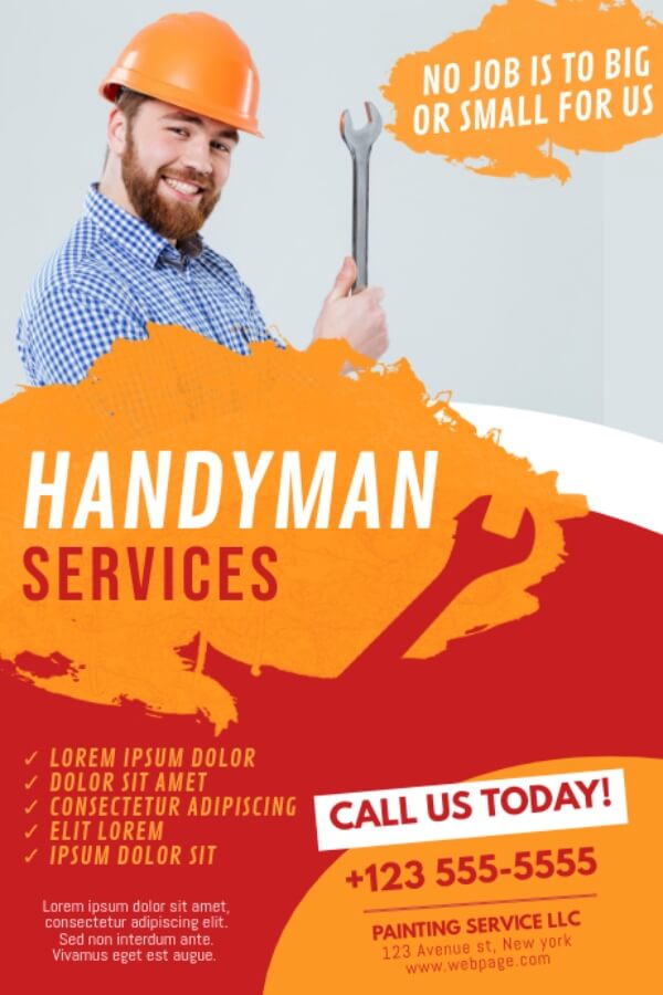
Just the goofy smile of the handyman is enough to do the trick in this design. The bright red and orange colors used in the design are quite unorthodox for a plumbing flyer, however, it works great to add a pop of color to an otherwise not very artistic business field. The orange construction hat is a nice touch that helps to tie the entire design together. The design also utilizes what looks like paint strokes/splatters, creating an outline of a wrench in the design, creating perhaps the most creative and joyful flier design in this list.
13. Handyman John Parker
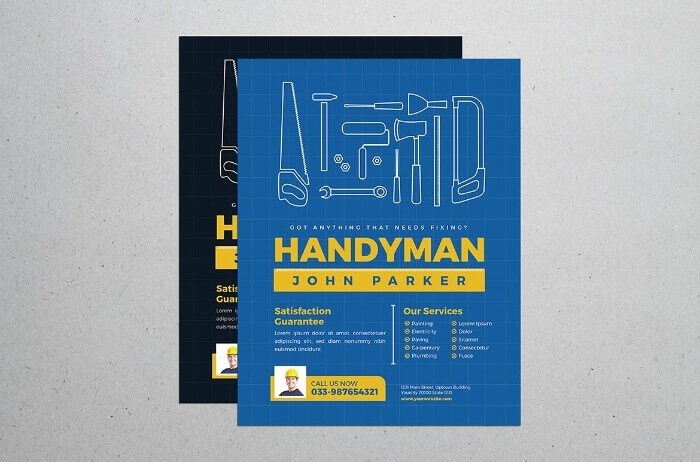
A great example of graphic design, this flyer is simplistic in that it is made up of only two colors, making it look clean and tidy yet exciting, as both colors are on the bright side. The white grid in the background gives the flyer a more uniform and high-end look. The outline of repair tools at the top of the flyer done in simple white color makes the design look minimalistic but very professional.
14. Purple
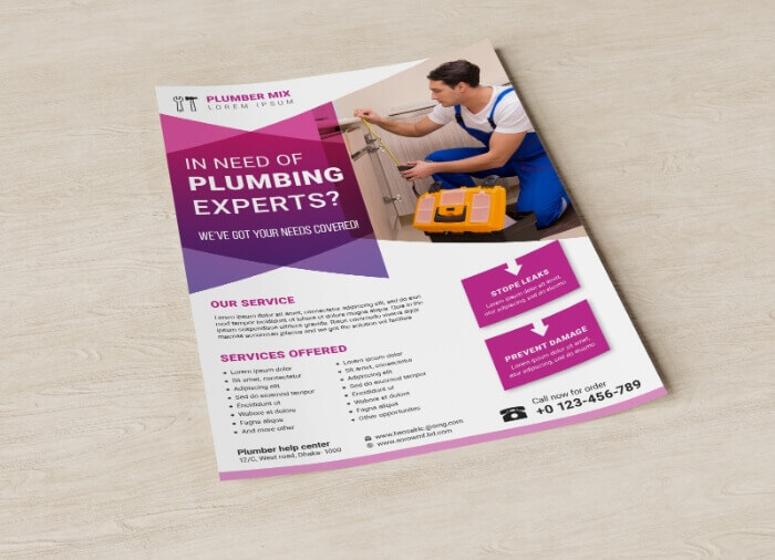
This last plumber services flyer design features yet another person in the design with a yellow toolbox, adding a nice pop of color. The various geometric shapes as well as the color purple against the white background give an interesting twist to the design, making it look more high-end and well-designed, a perfect choice for a newer plumbing service business.
For ideas on how to create a great logo for your plumbing business, check out our list of plumbing logos.
If you’re looking for inspiration to create a well-designed flyer for your plumbing business, then check out our list of the 14 most creative examples.
A design solution you will love
Fast & Reliable
Fixed Monthly Rate
Flexible & Scalable
Pro Designers


.avif)
.avif)
.jpg)
