

13 Yearbook Cover Ideas that Capture the School Spirit
These 13 cool yearbook cover ideas will inspire you to create beautiful and fun yearbooks that will win the approval of both teachers and students alike.

.svg)
Table of Contents

The best yearbook designs are the ones loved by students, teachers and parents alike. They make a strong first impression and tell a meaningful story below the surface. Here are 12 such examples to help you brainstorm the perfect cover design.
Let’s face it—yearbook staff hasn’t got an easy task. Aside from dealing with numerous students who are asking for a redo of their yearbook photo (or was that just my experience?), they are tasked with creating a yearbook cover design that will appeal to both students and adults (teachers and parents).
That’s why yearbook covers need to be appropriate, beautiful but also, fun and creative. Here are 12 yearbook ideas that stand out from the crowd and show the unique side of every school.
{{PRINT_PORTFOLIO="/dev/components"}}
Yearbook design with illustration
This type of cover might be the go-to design idea for elementary schools and kindergartens. However, we always say that illustrations are incredibly versatile and these beautiful yearbooks make a strong case for it.
From middle school to college—illustrations are definitely going to give your yearbook a more playful and interesting look.
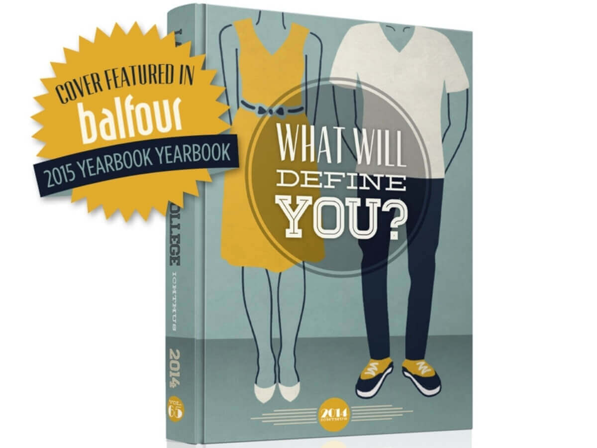
1. Lancaster Bible College
This gorgeous design could have easily doubled as a great book cover, however, it’s particularly poignant as a yearbook cover design. The yearbook staff opted to pair the big question “What will define you?” with a playful illustration. The clothes’ business-casual style makes an important link between a college student and a young professional.
2. Katz Yeshiva High School (KYHS)
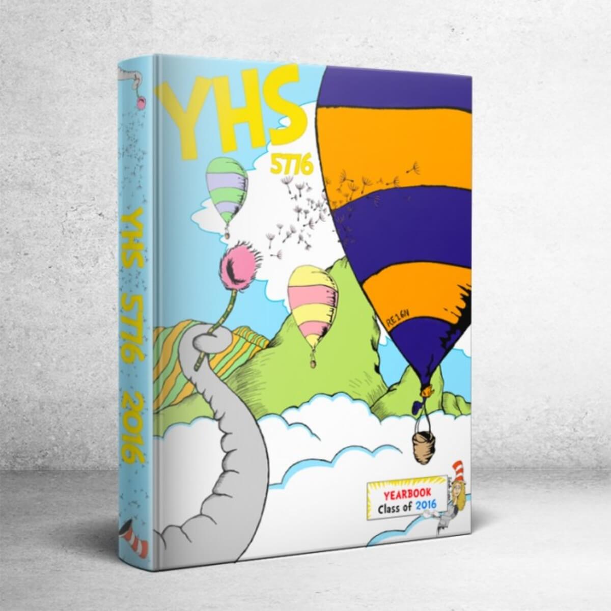
If you’re one to subvert expectations, this high school yearbook is something to aspire to. Dr. Seuss’ books are famously loved by young children and nostalgic adults, but these brave young adults have reminded us all that imagination is timeless. Moreover, they kept the yearbook theme throughout, even creating a Seuss-like poem on the back cover.
3. Greenwood Preschool
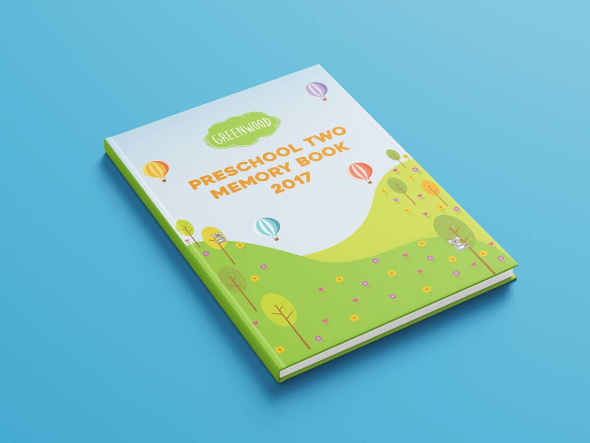
What I love about this yearbook idea is that the design layout is still fairly simple. Even if you design for young kids, you shouldn’t disregard the principles of good graphic design. Simplicity is your friend and this yearbook cover perfectly captures that with a limited number of design elements you can create a cohesive and beautiful whole.
Artistic yearbook covers
If you’re part of the yearbook staff team, it’s always a good idea to try and create something that people will want to keep. Of course, most people like to look back on school memories and old friends, but if the yearbook cover design is a mini work of art, they’ll be proud to display it on their bookshelf for years to come.
4. NSCAD University
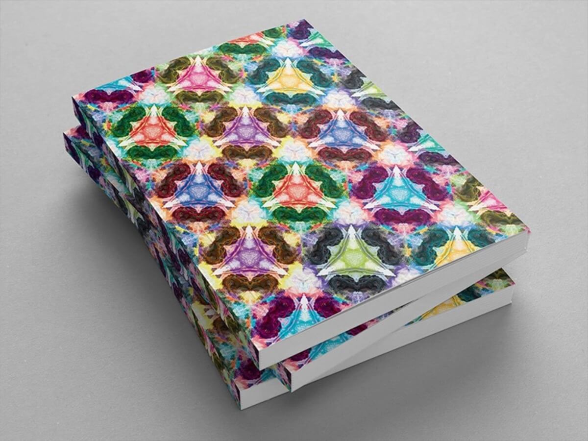
How amazing is this cover art created for the university’s graduation catalog! The kaleidoscopic design was inspired by the lion statues found outside the university building, which is a wonderful way to honor tradition but make the design modern and exciting. The graphic designer behind this one also notes that the color themes were also chosen
5. Blue Mountain High School
This dramatic design will certainly appeal to most high school students. However, it’s another one that does a great job of reflecting the school’s tradition. The eagle, also found on the school’s sigil, is represented through with a gorgeous watercolor illustration. The other colors in the same technique help tie the design together and draw the eye.

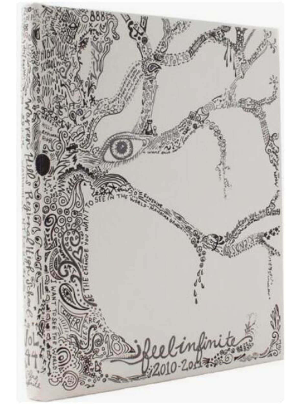
6. Warren Hills Regional School
Not all artsy covers are colorful, and this gorgeous monochrome highschool yearbook proves it. It captures perfectly the life of a middle school student with popular culture quotes and phrases and simple illustrations that resemble doodles you’d make in class. It also incorporates a poetic quote from The Perks of Being a Wallflower, a book (and later movie) that resonated with many a young adult misfit.
Yearbook layouts with photos
Yearbooks are, after all, about people. When it comes to cover design, there are several ways to go about it: you can show just a few students or try to fit in as many students as possible in some sort of collage.
This type of design is especially good if your yearbook pages are done in a magazine layout. This means that every page looks different, with blocks of text distributed unevenly and plenty of different visuals to make the design look more interesting.
Here are just a couple of yearbook ideas to get you thinking.
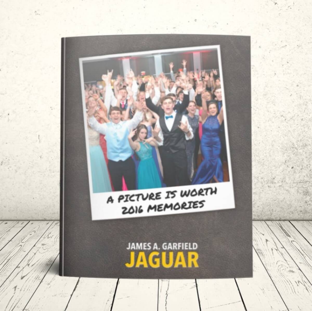
7. James A. Garfield High School
Proms are always events to remember and what better way to capture the moment forever than a yearbook like this? It’s got a cool retro vibe because of the polaroid frame. The yearbook staff still managed to do a terrific job at balancing a busy photo (look at all those students!) with a clean, elegant background.
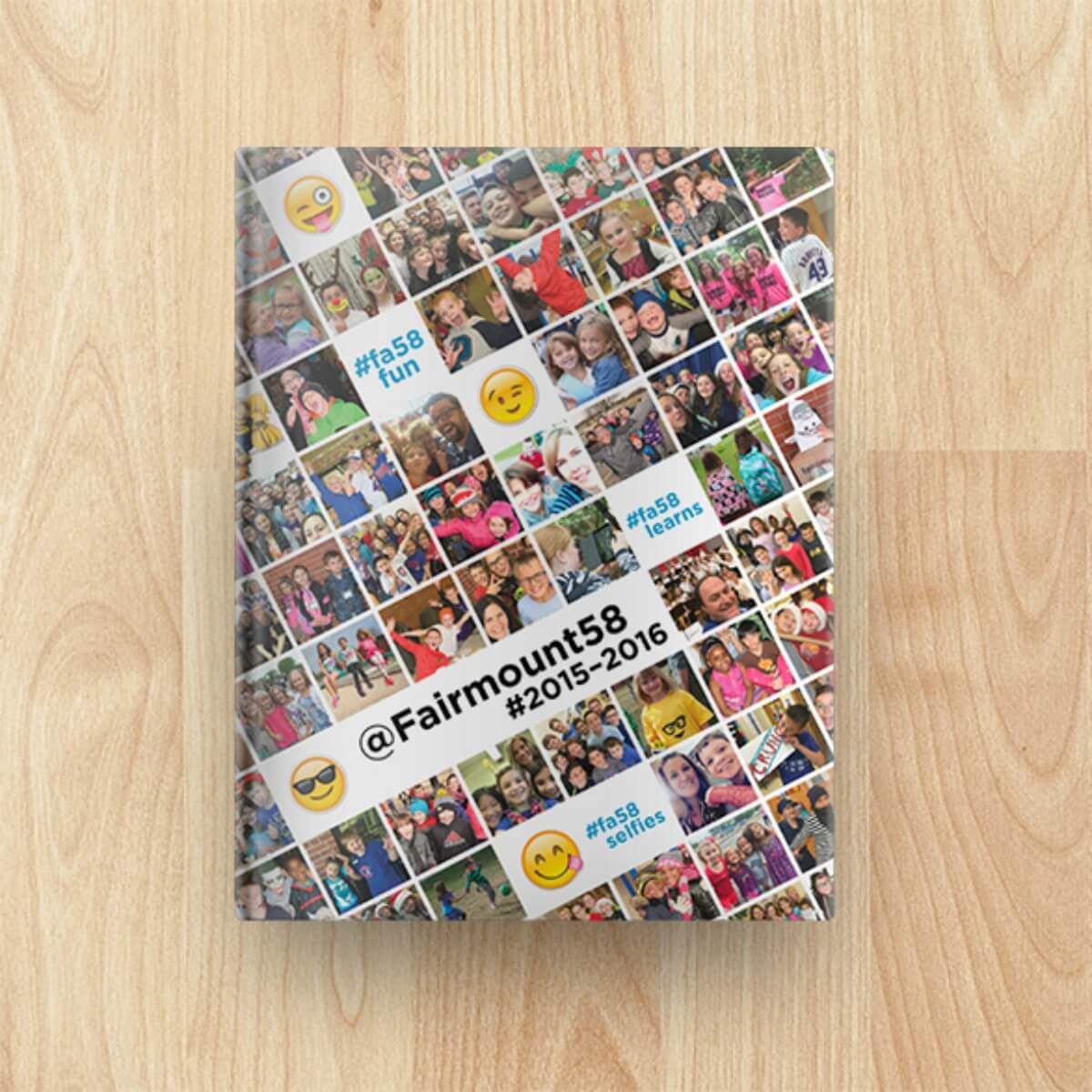
8. Fairmount School
Want to create a cover gallery of student photos? Then take notes from this elementary school yearbook that does a wonderful job at reminding us how much fun school can be. From costumes to funny selfies, extracurricular practices as well as emojis and hashtags: the wonder of childhood in the 21st century context.
Cool typographic yearbooks
We can’t sit with you? I hear you. Then your school is probably ready for a yearbook that’s awesome without trying too hard. Use a pretty cursive font (chalk fonts are always a good) or be brave with big, bold lettering.
On the other hand, if you’re struggling to find yearbook theme ideas, then it might be worth exploring this simpler, classier route. Custom typography and a thoughtful message can sometimes deliver quite a punch and resonate with the whole generation.
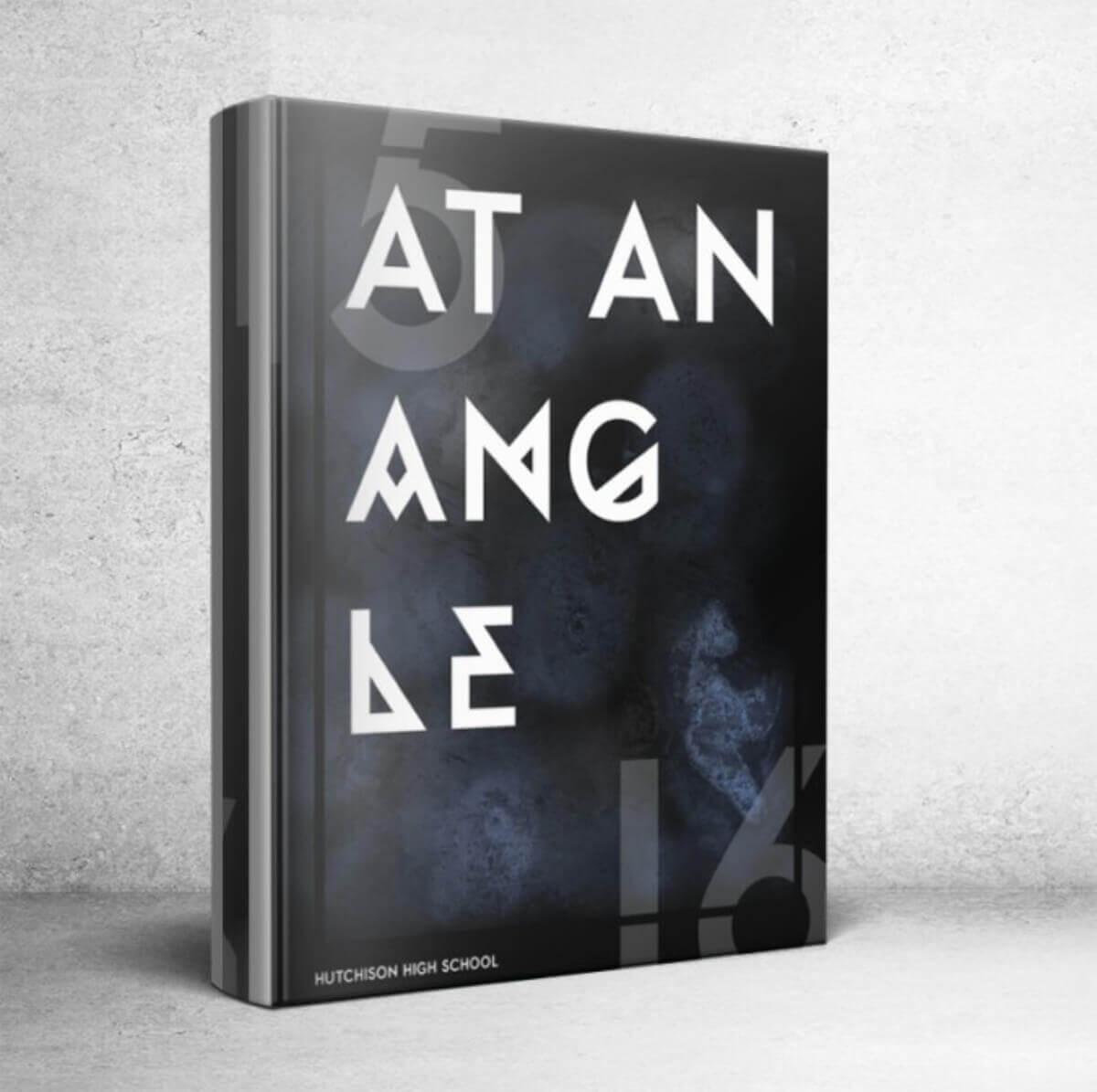
9. Hutchinson High School
These bold letters against a dark background make the cover resemble the opening credits of a movie. Everything is very well incorporated in a clean, linear design, but the mysterious shading in the background adds to the originality and creativity.
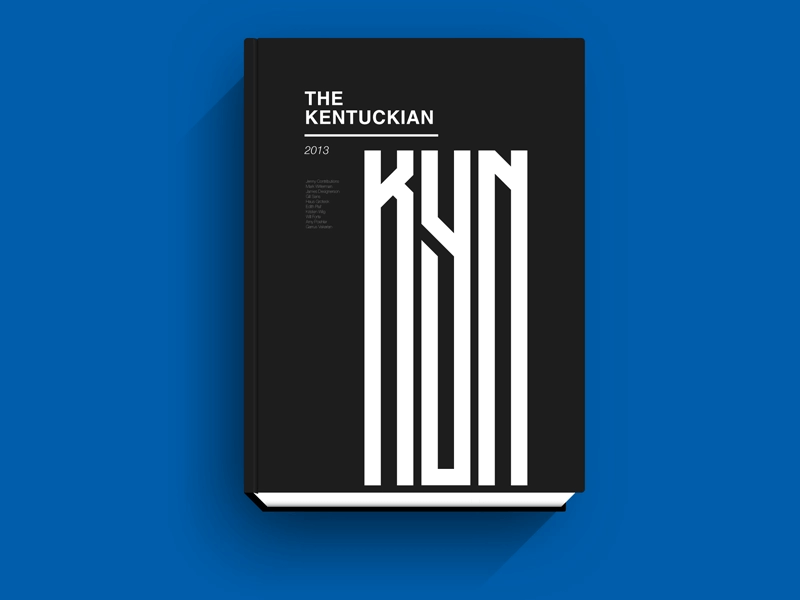
10. University of Kentucky
This simple, yet bold design is quite versatile. It looks great in print (almost like an art monograph), but this flat graphic was created by the cover artist for the university’s website. The upside is that a clean design like this is sure to complement pretty much any kind of web design, should you, for example, opt to create a digital version of your school’s yearbook. It's also easy to match your college logo with it.
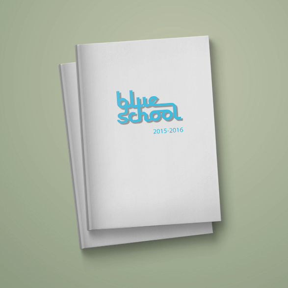
11. Blue School
This elementary yearbook stays true to tradition with a simple, retro typographic design featuring just the school’s logo (which is also the school name) on a white background. And sure enough, great graphic design like this one stands the test of time and as is cool now as ever!
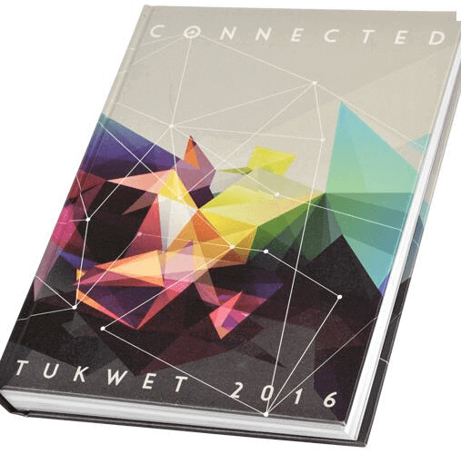
12. Tukwet Rancho
The yearbook theme here was “connected” and the geometric design elements were certainly a great choice for the cover. Lines and prisms are all interconnected and the elegant color scheme makes a very beautiful yearbook.
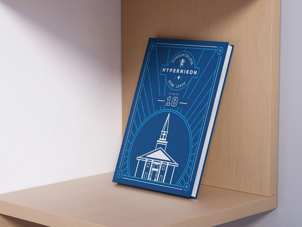
13. Gordon College
As we said, the great thing about geometric elements is that they allow you to do pretty much anything you like. Pair them with a classic font to help it pop, or use them as additional design elements in magazine layout design. Finally, you can also create sleek, modern covers by using geometric elements to create distinct images, like this one which features the college chapel against clean linework.
These 13 cool yearbook cover ideas will inspire you to create beautiful and fun yearbooks that will win the approval of both teachers and students alike.
A design solution you will love
Fast & Reliable
Fixed Monthly Rate
Flexible & Scalable
Pro Designers


.avif)
.avif)
.jpg)
