What Makes a Hero Image Heroic? Examples & Best Practices
.jpg)
TABLE OF CONTENTS
.jpg)
When you land on a website, what’s the first thing that grabs you? Is it the way colors pop off the screen or the feeling that the whole page is speaking your language? That perfect “hello” that instantly pulls you in—letting you know you’re in the right place. That’s the magic of a first impression, setting the stage and hinting at what’s to come.
But here’s the twist: it’s not always about the words. Often, it’s one powerful visual element—a hero image—that makes you want to stick around, feel welcomed, and explore.
A good hero image does more than just look nice; it tells a story and sets the tone for everything that follows.
So, let’s dive into what makes a hero image truly heroic.
{{WEB_BANNER="/dev/components"}}
What is a hero image?
When a lot of people think about hero images, they might jump to Facebook or LinkedIn banners. In theory, these do meet the standard requirements, but today, we’re going to focus on hero images on websites.
So what is a hero image, in web design terms? It’s that full-screen photo, video, illustration, or banner that greets visitors the moment they arrive on a web page.
This image takes center stage at the top of the homepage, often stretching across the entire width of the screen. Sometimes called a hero header or website hero section, it’s the first impression—a critical welcome mat that introduces your brand and sets the tone for what visitors can expect.
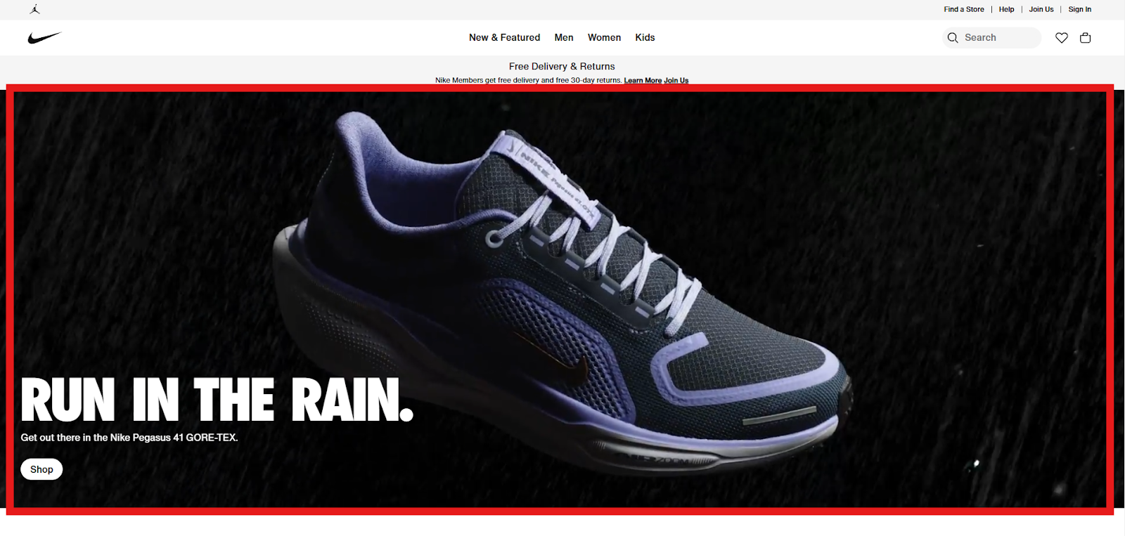
Ideally, the hero image also features your company’s unique selling point and often ties in with a conversion goal, like a CTA button or a signup form, transforming it into a key player in driving engagement and clicks.
The best hero image examples
The best way to understand the impact a hero image can make is to look at some of the best of the best. Keep in mind, for this style of visual, there really is no one-size-fits-all. Well, there are some dimensions that you should keep in mind (we’ll talk about those in a bit), but each brand will have its own style.
The best type of hero images are the ones that reflect the brand perfectly, and get the prospect eager to scroll.
For your inspiration, here are 7 of the best hero image designs that just get those creative gears turning, from brands you may or may not know.
1. Runway

What is Runway? Ah, it says it right in the hero banner image. For all the right reasons, this hero image stands out like a sore thumb. Why? Finance is boring to most, and the millisecond the page loads, users get smacked with the biggest selling point any finance company could offer.
As if that wasn’t enough, the banner is reactive. As your mouse moves over the banner, the clouds in the little window move as if you’re in a plane and flying in that direction. Subtle, but very fun, and it greatly enhances the user experience.
2. Corsair

In the world of PCs and gaming, visuals are everything. As important as it is that a computer is functional, to the right crowd, it’s equally as important that it looks good, too.
Corsair knows that, and they capitalize on it in their hero image. Like a cinematic masterpiece, this video banner swaps between different angles of the same setting, showcasing all the tiny little aspects that make this PC setup attractive to its target audience: gamers.
It’s flashy, hits all the right signals, and definitely leaves the viewer wanting more from Corsair. Overall, it’s a great hero image.
3. DJI

DJI is one of those brands that, even if you’re not into drones, you’re probably familiar with. When drone tech took off, DJI was at the forefront, pushing out innovative products at every turn, and earning them a very well-deserved spot at the top of their industry.
All that innovation shows even in their website and hero image. Using the space, they put some of their flagship products right in the spotlight. It’s a simple tactic, sure, but they know that their products are sleek and attractive, and the hero image is the perfect place to let others know, too.
4. Birdie’s

It’s hard to utilize more than just the sense of sight online, but somehow, Birdie’s makes it happen with their website hero images. Their food looks delicious, and it’s very unique. So, knowing that they have a lot of variety, they incorporate it into their restaurant branding and display some of their most popular food, but they do so in a side-by-side format that showcases the options, too.
5. Stanford University

Stanford is an Ivy League university that has a ton of history. This reputation can be hard to portray in the first few seconds unless the hero image on website space is maximized.
From a static image, you get a real sense of how big and impressive the main campus is, and the rich history that is on display there, and start to understand why this school is so renowned.
What’s also important to notice is the overwhelming lack of text. Other than the name and a few menu options, the visual takes center stage and garners all the attention.
6. Urban Cultivator

Eat better food. Something we could all do a little more often. But it’s difficult, isn’t it? Well, the hero image on websites like the one from Urban Cultivator tends to make us believe otherwise.
The video banner shows all the nooks and crannies that better food could be grown in, right in our own houses. It gives a real sense of ‘Oh wow, maybe I can do that’, which is a huge buying signal for most prospects. All of this, without even reading the subtitle, which reaffirms this notion.
7. Smart Trip

Doesn’t this hero image design from Smart Trip just make you want to do something fun? That’s the idea! Smart trips focus on high-energy tours around some of Italy’s most recognizable cities, making it very attractive for their target audience: students.
From a single static image, you get a real sense of adventure. This image also captures the idea of making memories, which is their main selling point for students abroad.
Hero image sizes
Alright, we’ve talked about what a hero image on websites is and given some examples. Now, it’s time you go and create one of your own. But, in order to do that, there are some best practices that you should keep in mind, more specifically, hero image size.
Full screen hero image dimensions
When we say full-screen, we’re talking about a hero image that is ideal for computer and laptop screens. These images specifically should be 1280x720 pixels wide, with an aspect ratio of 16:9.
However, if you’re going for a banner, something that encapsulates the full width of the screen, it’s best to go with a 1600 x 500 pixel hero image size.
From there, if you have an image that has a lot of detail, maybe like Smart Trip above, you could even go up to 1800 pixels for a crystal-clear image.
Mobile screen hero image dimensions
Mobile screens are smaller, therefor the hero image dimensions should be smaller, too. This can be tough, as there are so many different mobile options, but the ideal mobile size is generally 800 x 1200 pixels.
A little pro tip here is to make the mobile hero image static, even if your desktop website’s isn’t. Videos on websites can boost performance, but typically take more juice and can affect the load time on mobile. Plus they don’t often look the same in a mobile aspect ratio. But, let’s save the other best practices for the next section.
5 Tips for Creating a Hero Image
We’ve hinted at the importance of a good hero image above and now seems like a good time to re-stress that point. After all, they’re called “HERO” images for a reason.
So with that said, it’s important that they look good, and that they’re done right the first time around. So, what are some good ways to make sure that happens? Follow these 5 tips below.
1. Use visuals that add value
In some of the examples above, we highlighted the fact that they use strong wording and imagery to really sell their product/service. This is probably the most important thing you can do!
Use your products, or center-frame your best value proposition. There are lots of studies out there that indicate that you only have a few seconds to reel someone in. Some of these cases claim that it only takes about 3 seconds to lose someone. You have to be ready to tell or show them something as if it’s the last thing you’ll ever do for them.
2. Center your content
Naturally, our eyes focus on the center of the landing page as soon as it loads up. From there, our field of view takes them to what looks the most interesting. But again, we only have a few seconds here.
For that reason alone, your main image and copy should be as centered on the screen as possible. No ifs, ands, or buts about it. Sure, you’ll find an odd example or two that are trying to be different. For them, it may work, but in general, it’s best to stick to the natural format and follow the latest website design trends.
3. Make it stand out!
This might seem obvious, and sorry for yelling, but this is so important to remember. We’ve all seen our fair share of bland websites, and 9 times out of 10, we lose interest before our finger hits the scroll wheel.
In addition to everything above, your hero image should POP. This could be with the use of vibrant colors, a video, or something that makes someone say ‘Whoa’! Like this one, from High Street Market & Deli in California:

It’s vibrant, eye catching, and really makes you want that sandwich. In this case, all it takes is good lighting and a high quality camera.
4. Make sure the images are the right size
We talked about dimensions and aspect ratios above, but anyone who views your website must get the right picture. How? By making the hero image responsive. This is done by setting the media queries to allow banners to adapt to screen sizes within certain parameters.
This requires a bit of HTML coding, which is not everyone’s strong suit. But it can be done. The video below shows how you can do it, too:
5. A/B test your hero image
A common practice in marketing, A/B testing allows you to show different audiences different hero images. Displaying different versions of your page to a random sample of visitors allows you to use data to see which version drives better conversions.
Of course, this topic goes a little deeper and requires some marketing tools and at least a basic understanding of how to read data. But, if you really want to know if your hero image is making an impact, this is the best way to do it.
Conclusion
And there we have it. All of the ingredients that go into a powerful hero image potion. Now, it’s important to remember that all of this is going to 100% depend on your brand and what you’re selling. Even if you’re in the same niche as some of the examples above, it doesn’t mean that the same style will work for you.
In any case, it’s best to trust branding and design experts like ManyPixels. Instead of scratching your head and worrying yourself with tiny tweaks, you can trust professionals from the get-go and have a powerful hero image in no time.
In fact, by utilizing ManyPixel's subscription-based service, you can have several on-brand and professionally designed website assets created for you. For just $599/month, you get access to unlimited design requests with a 1-2 day turnaround.
Our service now offers a Webflow development add-on, so you can get your website designed and launched all in one place!

Top-quality designers
A complete creative team at your fingertips: graphic and web designers, illustrators, and more.
Lightning-fast turnaround
Get start today and receive your first update on the next business day.

All-inclusive pricing
Unlimited requests and revisions. One flat monthly fee. No surprises.

Flexible & scalable model
No contract. Scale up and down as needed. Pause or cancel at anytime.

Continue reading
Explore some of our best designs
Get inspired by a curated selection of ManyPixels work. Download the portfolio to see what our team can create.






.jpg)
.jpg)
.jpg)