
Tips to Design Forms For Your Website
We encounter web forms almost daily. Knowing how to design forms that are simple & intuitive can help your business thrive . Here are a few key tips.

.svg)
When they hear the word form, most people think of the tedium of bureaucracy. And who can blame them? However, in the digital sphere, forms are more important than ever. Whether it’s signing up for a new email address or streaming service, you fill out web forms every week. If you need to design forms for your business, here are some tips on how to design web forms that will enhance the customer’s experience.
Web form design is an often overlooked, but essential part of creating a website or app. Think about it this way: how often have you entered your personal information into a website so you could buy something, register for a service, or book an appointment? Probably countless times. But, we don’t often think about how to design a form. It’s something we do automatically, sparing little attention to the details.
Types of web forms
Web form design might seem simple enough at the first glance, but there’s quite a bit more to it than we might think. First of all, you must have a clear idea of what kind of form you need for your project. For example, a signup form is one of the most common types of form designs. It usually has slots for entering your email or username for that particular site, as well as a password slot.
On the other hand, value forms are a great marketing tool. They offer some added value, like a discount code in exchange for a customer's email address. E-commerce websites and online shops often use them for creating email marketing campaigns.
Then, there are pop-up forms, which appear most often for online magazine subscriptions. You do have to be careful when using pop-ups, as they can be vexing to the users and thus have the opposite effect when it comes to attracting and retaining customers.
Last, but certainly not least, we have the shopping form. It is probably the most used type of web form design. E-commerce is a multi-billion dollar industry, spanning all continents and all types of goods and services. To design forms that help the customer finish their purchase easily and stress-free should be an e-commerce business’s top priority.
There are hundreds of examples of good form design you can turn to for inspiration. It might not be the flashiest aspect of web design, nor indeed the one that lends itself to artistic interpretation the most, but it certainly is vital in keeping the internet sphere running as it is.
Form design tips
Fortunately, the basics of form design aren’t that difficult to get a hang of. It does require a little patience, but learning will without a doubt come in handy at some point in time. What are form design best practices and how to design a form that will be easy to fill and won’t be burdensome to the user? Let’s have a look at some tips.
1. Be intentional about the information you ask for
No one likes having to fill in pages upon pages of information just so they could book a hair salon appointment or buy a lampshade. It’s unnecessary and can be perceived as too inquisitory, with 60% of customers saying that forms are invasive. Designing forms is all about streamlining and cutting the excess.
For example, the essential information for an appointment booking form is the name, contact info, and chosen time slot for their appointment. You don’t need your client’s address or, in most cases, their birth date.
The same goes for newsletter signup forms. The only information you need is their email address and maybe their name. Asking for more than that might arouse suspicion and make the customer wary of your website.
When you design forms, the first, essential question is why do I need this information? If you can’t think of a legitimate reason, you probably shouldn’t ask for it.
2. Mark required and optional fields
Coming in at the heels of the previous tip, if you do want extra information make sure the user knows they are not obligated to provide it. Marking the required fields with an asterisk (*) has become standard practice and for good reason. It’s simple, universal, and easy to implement in the form UI design.
With the ever-growing privacy concerns on the internet, it’s nice to know we don’t have to have every piece of our personal information out in the open. Even better is to have a brief explanation why you are asking for extra details, and what you would use them for. That way, the user might be more willing to oblige, and not lose trust in your company.
3. Give hints
When it comes to online form best practices, it’s often better to over-explain than leave users confused and wondering what it is that you’re asking them to do. Different countries have different ways of referring to areas or addresses and you need to take that into account.
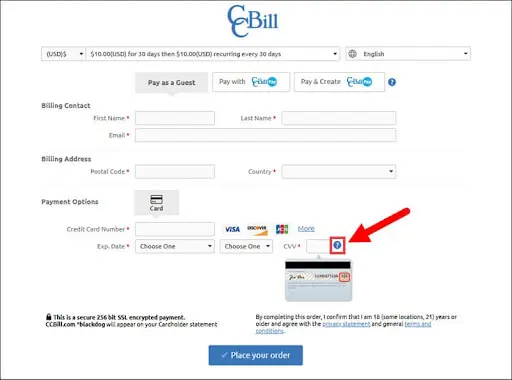
A good, everyday example of this is in online shopping forms. Almost always, you’ll see a helpful hint about what a CVC or CVV code is for card payments. Even though everyone’s probably learned it by now, it’s good to have a reminder. You never know if the purchase someone makes on your site is the first online transaction they’ve ever done.

There are, of course, self-explanatory input fields (like name or birth date), so naturally, you won’t need to explain what those mean. Best form design is always about combining common sense logic and anticipation of actual customer needs. 4. Consider auto-filling slots
If you have a large number of returning customers, congrats, you’re doing it right. This means a big portion of your customer base is familiar with your form UI design and the transactions probably run smoothly. But, there’s always room for improvement.
Having the basic slots pre-filled saves the customer’s time and can be a great feature for your web form. This makes everything run faster and it spares the customer the bother of filling in the required fields every time they want to make a purchase.
However, be careful to leave the option of making corrections, especially for addresses, and other information that’s bound to change at some point in time.
5. Make sure you’re clear about the required format
If you have an international customer base, you must make sure they understand how to fill all the fields. It’s good to have explanations in the dummy text in the slots themselves.
The most obvious example of this is the difference in date formats (dd/mm/yyyy is the correct one, no one will convince me otherwise). So, making a distinction is the best thing you can do.
6. Make multiple-choice fields easy to navigate
Form fields such as country, age, or gender are just some of the types of multiple-choice fields that regularly occur in forms. There are a few different ways to configure the available options.
Radio buttons are most often used for simple, straightforward questions that require only one answer. A good example would be when a medical insurance form asks if the customer has ever broken a bone. Yes or no questions typically rely on radio buttons.
Checkboxes are another common type of multiple-choice form fields, and they are great for when the customer can have several answers to the same question. This again comes in handy in the medical field, or for a university course registration.
However, drop-down lists are a much better option when you can have many different answers. Searchable drop-down lists are most often used for selecting your country or its telephone code.
7. Avoid reset and clear buttons
We’ve already established that people generally dislike filling in forms. What they dislike even more is spending time completing a form and then accidentally deleting their progress and having to start all over again.
Reset buttons are the silent killer of good web form UX. Not only do they cost the customer extra time, the loss of entered data will also deter the customer from returning to your site.
If you decide on having a reset button, make it as out of the way as possible, and be sure to have a save button as well. You should also consider adding autosave if at all possible. It’s a great feature to have regardless of whether or not you add a reset button.
8. Use color-blocking to create a neat layout
Color coding is a staple in UX/UI design. Having buttons in different colors helps them stand out against the background and makes the design more user-friendly and accessible. So, it stands to reason that adding color to web forms would be a good idea.
You want your CTA buttons to be visible and distinguishable at the first glance. It would be a good idea to make your submit button green or blue, as these colors suggest affirmative responses.
On the other hand, red or gray buttons are most commonly used for canceling or leaving the page. As we’ve said before, be careful about adding cancel buttons, as they might add confusion and irritate the user.
However, you must be careful not to add too many colors. Keep the background neutral and add contrasting colors sparingly and with intention.
9. Enable repeating fields
You often need your customers to fill in the same information for several people. This most often occurs in ticket booking, as well as various administrative forms.
Rather than lumping pages upon pages of headache-inducing forms, simply create an “add new form” button so the user can have a clearer picture of what they need to do and decide for themselves how many forms they need to fill out.
Form UI design is all about making the customer as unburdened as possible. If, for example, someone is traveling solo, they certainly wouldn’t like seeing multiple fields asking for the same information.
10. Be specific in your error messages
We all make mistakes while filling in web forms. There’s nothing more irritating than thinking it’s finally over when an error message shows up and stops you from completing the process.
Even worse than that is an error message that reads simply “there is an error” or “cannot submit”. We don’t know where we’ve made the mistake, and abandoning the process is starting to look even more tempting.
But, if the error message is specific about what kind of mistake we’ve made, it will be easier to correct it and complete the form.
The most common example of this is in password selection. Make sure to let the user know what the password must entail. That way, if a password requires eight characters, a capital letter, and a number the user will know which one is missing.
Conclusion
The knowledge of how to design web forms is an essential skill, not only for web developers, but for almost any small business owner, and even researcher. There are many great platforms for creating forms, and while creating them and filling them in might not be exciting, they will certainly make it easier.
I hold two degrees in history, and am currently working on a project of creating a digital library of Medieval manuscripts. I still like to have a foot in the 21st century though, so I write freelance about my other big passion, art and design. All Lord of the Rings references and puns I make are intentional.
A design solution you will love
Fast & Reliable
Fixed Monthly Rate
Flexible & Scalable
Pro Designers


.jpg)
.jpg)
