
Advertising Trends in 2025 To Use In Your Marketing Strategy
We’ve done the research so you don’t have to. Here are the most important advertising trends to include in your marketing strategy.

.svg)
Learn everything you need to know about the hottest advertising trends, and which styles can make the best match for your brand.
Ad design evolves very quickly. If you look back on the ads you used 5 or 6 years ago, you’ll probably notice that they already look quite outdated.
This is especially true of digital advertising, since some more traditional advertising forms such as TV or print design for small businesses, usually have a slightly longer expiration date.
However, if you want to stay relevant and create ads that will help you convert leads into customers, here are some trends and styles of ad design today that you need to know about.
{{AD_BANNER="/dev/components"}}
Artificial intelligence and automation
AI design is here to stay. And although generative AI can never replace human designers fully, not embracing this technology would be a huge mistake for your marketing efforts.
Brands are no longer just experimenting with AI—they’re deeply integrating it into content creation, targeting, and campaign optimization.
Generative Engine Optimization (GEO) is another significant AI-driven shift. As consumers increasingly rely on AI search engines and conversational assistants like ChatGPT or Google’s Search Generative Experience, brands are optimizing content for these tools rather than traditional search engines alone, which is bound to make significant changes in content marketing.
Tools like ChatGPT can be used to generate campaign copy and ad creative, although it’s vital to ensure that the style still fits your brand voice.
Talking about AI design there’s still a fine line between using it well and overusing it. Use AI to automate certain tasks, such as creating different variations of an existing design.
Streaming, connected TV, and retail Media
Streaming is where audiences are, and advertisers are following. Brands are using programmatic platforms to reach viewers with video content, personalized messaging, integrating connected TV (CTV) campaigns with mobile, desktop, and even in-store advertising to create a seamless omnichannel experience.
This trend is particularly important because consumers no longer follow linear viewing habits—advertisers need to meet them across multiple screens throughout the day.
Retail Media Networks (RMNs) are another huge retail trend to follow in 2025. Giants like Amazon, Walmart, and Tesco are monetizing their customer data, allowing brands to reach shoppers at the point of purchase. Unlike cookies that provide third-party data, this data comes directly from transactions, making it highly valuable in a privacy-first landscape.
Authenticity
Precisely because of the enormous growth of AI in advertising, it’s never been more important to stay genuine.
Even if you use AI tools for some parts of it, your ads should resonate with your target audience and reflect your brand values. A great way to do this in social media advertising is to rely on user generated content - 69% of consumers say they trust real people (friends, consumers, influencers) more than brands themselves.
On top of that UCG is often also quicker and less expensive to produce. So, you can end up with high-performing ads, while reducing costs and saving time.
Diversity and representation
It’s a little depressing that we have to single this one out as a trend rather than common sense, but in case you missed the news - here’s your reminder!
Representing people of different backgrounds is important, not only as a way of attracting said groups to your brand but as a way of showing existing clients that you care about these big issues.
Many big brands all moved in a more positive direction regarding this recently, however as a small business owner make sure you take this matter seriously, rather than just jumping on the bandwagon for the sake of it (a big brand that gained notoriety with this is Pepsi and its infamous Kendall Jenner Black Lives Matter ad).
Make conscious decisions to keep your ad design inclusive. This example from Uber is a great one to learn from. Instead of showing just one figure, the different character designs make a powerful case for inclusivity, without being “too obvious”: women of different races, religious backgrounds and ages should learn about safety guidelines and this ad conveys the message perfectly.

Sustainability
Another one on the “obvious” list, eco-friendliness and sustainability have been in the public discourse long enough that it’s practically impossible to ignore them.
When it comes to ad design, this is particularly important for packaging design. A recent report shows that 74% of consumers are willing to pay extra for sustainable packaging, so spending a little more to create it can help you build some brand loyalty and perhaps even boost sales.
Packaging design is part of your brand identity, but also a form of advertising, so you need to make it appealing as well as eco-friendly. If you’re unsure about a design: keep it minimalistic. Not only is this a good way to ensure you aren’t using an unnecessary amount of packaging materials, but also provides a trendy look.

Contrasts and imperfections
Natural and artificial. Modern and retro. Pantone’s 2021 colors, grey and yellow. Last year was a year of disruption, so the trend in 2021 is going to be thinking forward and innovating.
To be fair, this trend covers some of the ones we’ve already mentioned: bold, psychedelic designs or stark contrasts in font pairings.
Forget about textbook graphic design principles and create ads that deliver a punch. If we’ve learned something about ourselves last year, it’s that life can be messy and ugly, and there is still a potential to find beauty in it. Don’t take yourself too seriously, and try to create ad design that genuinely speaks to your target audience.

Geometrical shapes
Probably one of the most striking changes from previous design trends is the more common use of geometric shapes over flowy abstract ones.
Geometric shapes can help create a sense of order and coherence, however, in line with the previously mentioned use of contrast, they can work very well in different contexts, and be playful and creative as well as professional and serious.
For example, our own rebranding that took place at the beginning of the year relies heavily on geometric shapes (more specifically the square representing a single pixel). It’s a simple way to give a vast variety of different visuals (from blog covers to website banners) a coherent look that still reflects the youthful and vibrant nature of our company.


3D design
We’ve already mentioned the timeless and simple flat illustrations, but another style that we’re going to see a lot more of is 3D illustrations. They come in many different variations, from combining with photography to blur the line between reality and fantasy to playful animations and motion graphics—this type of design can help you engage viewers and decrease bounce rates.
It’s by no means a new trend, but the move to bolder, quirkier aesthetics is going to give this design style a much more prominent role in ad design.
Unlike the very versatile flat icons and illustrations, these 3D designs might not immediately fit every type of business or ad; but if your audience is predominantly young, then this is definitely a design route you should explore.


Personalization and dynamic creative optimization
Personalization has long been an important trend in advertising. But in 2025 and beyond it’s no longer a nice-to-have, but the foundation of every good customer experience.
With dynamic creative optimization (DCO), brands can swap out ad elements like headlines, images, or offers in real time based on user data and context. This approach makes ads more relevant and increases conversion rates.
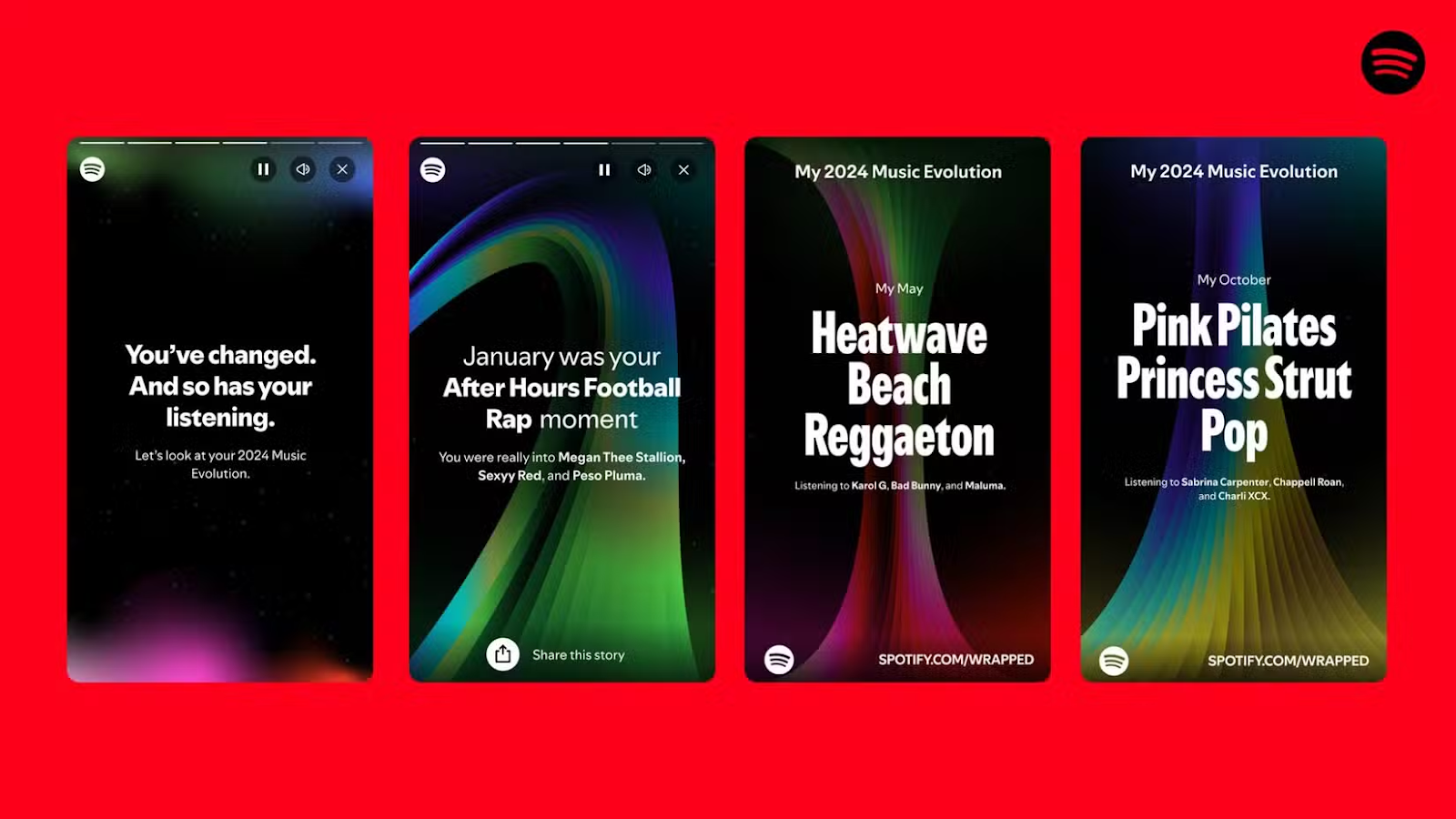
One of the most important examples of this trend is Spotify Wrapped. What’s great about this marketing campaign is that every year Spotify finds new clever ways to make the Wrapped experience even more personal. For example, 2024introduced "Your Music Evolution," a feature showing how listening habits changed through different "phases" of genres and artists.

Similarly, Nike’s personalized product recommendations in email and app ads show how tailoring creative at scale can drive both loyalty and sales.
Data visualization
With audiences becoming more skeptical of bold claims, brands are increasingly using data visualization in ad design to build trust. Simple charts, progress bars, or numeric highlights can make abstract promises tangible.
Google’s annual “Year in Search” turns billions of search queries into emotional visual storytelling, showing people what the world cared about.
Fintech companies like Monzo and Revolut frequently incorporate visuals of savings goals, spending breakdowns, or progress trackers into their ads, making financial data approachable and persuasive. For marketing in 2025, this trend is about more than aesthetics — it’s about proving your message visually, not just saying it.
Influencer marketing
Influencer marketing is by no means a new trend. However, as brand trust decreases it’s more important than ever to give your brand a human face.
Influencer marketing continues to evolve in 2025, shifting from one-off sponsorships to deeper creative collaborations. Instead of simply endorsing a product, influencers now co-create ad content that blends seamlessly into their personal style.
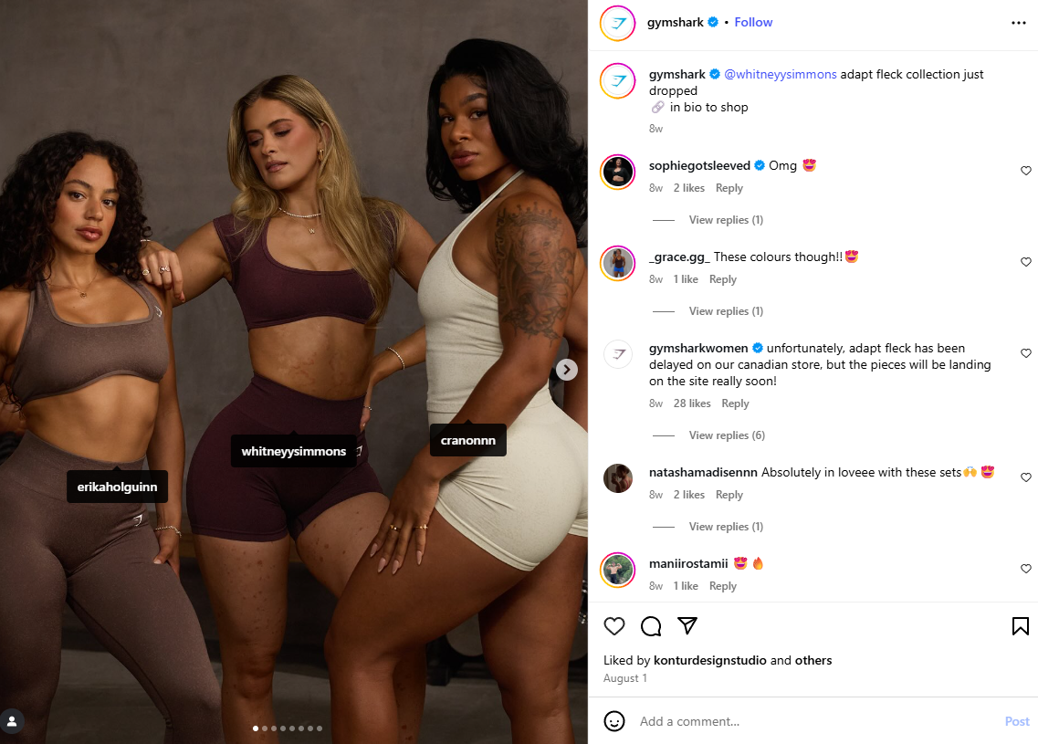
A strong example of this is Gymshark, which has built its brand identity by partnering with fitness influencers who create workout content featuring the products rather than traditional ads.
They collaborate with influencers that create content related to fitness to ensure their ads reach the right audience. However, they’re also real trend-setters in marketing and often start TikTok trends and challenges, with the help of popular TikTokers.

Meme culture & playful weirdness
We’ve mentioned several times how important it is to find a genuine brand voice. In 2025 and beyond that can also mean embracing your quirky and playful side.
In 2025, ads that tap into meme culture and internet-native humor are outperforming overly polished, corporate-style campaigns. Younger audiences, especially Gen Z and Gen Alpha, respond to brands that aren’t afraid to be weird, self-aware, or even chaotic.
An almost iconic example is Duolingo’s TikTok strategy, where its owl mascot stars in absurd, meme-worthy videos that rack up millions of views and shares.
When tapping into this trend it’s very important to choose your social media platforms wisely. For example TikTok and Instagram are probably better for this type of quirky short-form videos, with younger users who might respond better to this type of content.
The bottom line
When it comes to ad design, whether it’s print ads or social media ads, knowing the key trends will help you stand out from the crowd and reach your target audience.
Many of these advertising trends relate to staying authentic in a new digital landscape that’s transforming thanks to AI. And while AI tools can be a tremendous help, it’s important to remember that high-quality content always comes from actual creatives.
So, if you need a bit of help with designing high-quality ads, you’re in the right place. Getting graphics on demand with ManyPixels is simple, affordable and flexible - perfect for testing out new advertising strategies in the year ahead.
Star today at just $599 a month, or get in touch with us to learn more about it.
Having lived and studied in London and Berlin, I'm back in native Serbia, working remotely and writing short stories and plays in my free time. With previous experience in the nonprofit sector, I'm currently writing about the universal language of good graphic design. I make mix CDs and my playlists are almost exclusively 1960s.
A design solution you will love
Fast & Reliable
Fixed Monthly Rate
Flexible & Scalable
Pro Designers


.jpg)
.jpg)
