
.avif)
YouTube Banner Size Fit for Different Devices
If you want to take your YouTube channel, a custom banner is a must. Discover what size is the YouTube banner size you need to make sure your channel art looks right.

.svg)
Table of Contents

There are plenty of YouTube banner templates you can use for free, but if you want to create something from scratch, you’ll need to know the right YouTube banner size for all devices.
First thing’s first— what is a YouTube banner? It’s the image found on the top of your YouTube channel page and it’s also often called channel art. It’s similar to a cover photo on social media platforms like Facebook, Twitter, or Linkedin.
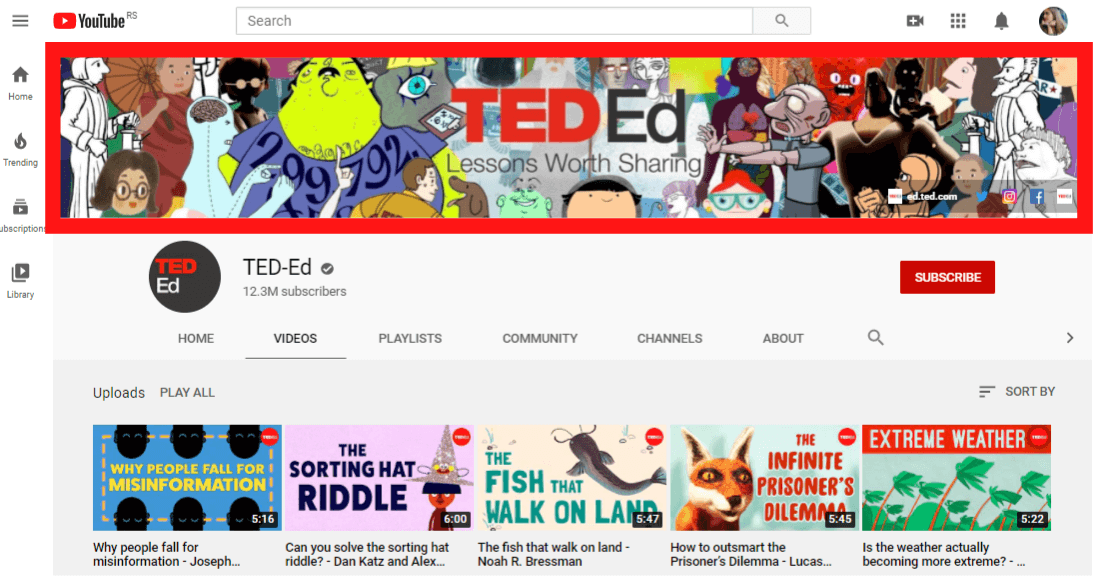
Now that it’s clear what we’re talking about, it’s time to discover what is the YouTube banner size you’ll need to make everything look right
{{SOCIAL_BANNER="/dev/components"}}
Why is YouTube banner size important?
You know that Youtube thumbnails are important - they have a direct impact on click rates.
But why even bother with YouTube banners?
The most important aspect of a creating your YouTube banners is building a strong sense of brand identity. You wouldn’t trust a Facebook page without a cover. And LinkedIn profile without a banner always looks less professional.
The same goes for your YouTube channel. Your banner is a way to tell people what your channel is all about in one glance. It’s also a powerful way to promote your latest products and offers.
For example, music stars like Taylor Swift regularly update their YouTube banner to fit their latest songs or album releases.
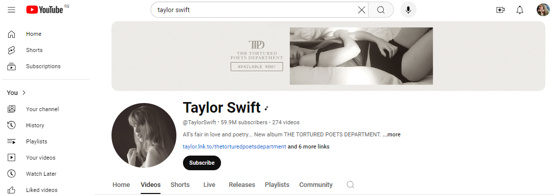
Understanding the best dimensions for YouTube banners will ensure your banners look good on all devices, and make a powerful impression or call to action.
Best YouTube banner size
Here’s a quick rundown of basic YouTube banner size guidelines.
- Ideal YouTube banner size: 2560 x 1440 pixels
- Minimum dimensions: 2048 x 1152 pixels (or a 16:9 aspect ratio)
- Maximum width: 2560 pixels
- Safe area: 1540 x 427 pixel
- Accepted file formats: JPG, PNG, BMP, GIF
- File size: up to 6MB
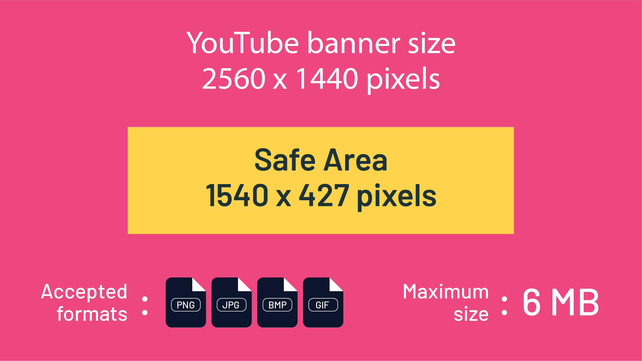
Channel art size, safe area and aspect ratio explained
Imagine uploading your custom YouTube channel banner on your laptop and it looks great. But when you open your smartphone or tablet display, key design elements like your logo or channel name get cut off. Or your Youtube banner image gets stretched out and pixelated on large TV displays.
The reason for this is that YouTube channel art displays differently on different devices people use for watching. So if you want to make sure that you’re using the right YouTube banner size for all devices, you should stick to the recommended size guidelines.
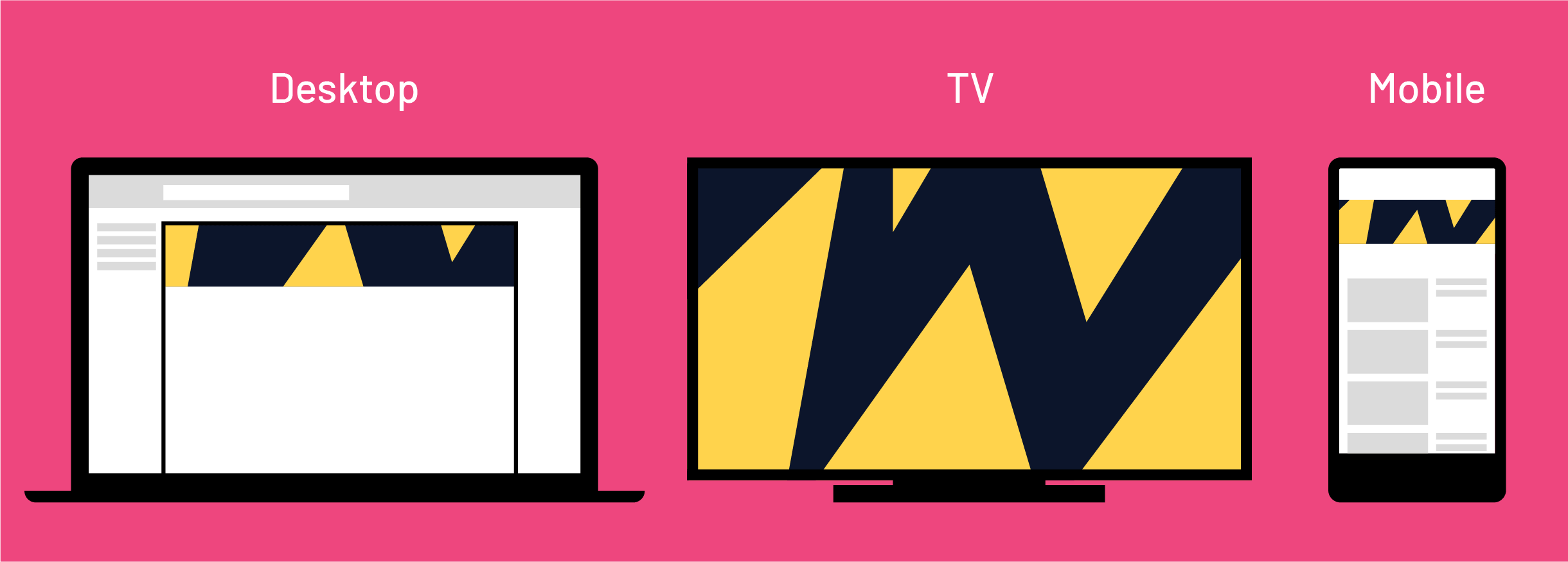
Banner image size
Since you can only add one banner image, you have to make sure that your banner design is fitting to any screen size. It would be bad marketing practice to have viewers see a non-fitting image when they first discover your channel otherwise.
Making your banner image at least the minimum dimension of 2048 x 1158 pixels will prevent it from stretching out on TV displays, where it shows up as a background image. That’s why the best size for Youtube banner images is 2560 x 1440 pixels since this is suitable for larger images on TV displays.
Of course the higher the quality of the image the better, so long as the file size is under 6 MB (which is quite generous, so most high-quality images should fit into that range).
If you want to use a larger image, you can always try making it smaller or converting the PNG file into a JPG file.
Safe area
The safe area (or safe zone) on your channel banner is the area where you should place all the key information (logo, channel name, channel button, tagline) so that it’s visible with all screen sizes.
With standard channel art size (2560 x 1440 pixels) safe area should be 1546 x 423 pixels, placed centrally. This will ensure that the key information is visible on mobile devices.
If you’re using an online graphic design tool like Canva or Snappa, and aren’t sure whether you’re out of the safe zone, create a simple rectangle frame and check.
You can also try some more extensive DIY design solutions, such as Glorify. There are thousands of handy templates as well as customizable 3D mockups. Branding tools, such as a logo maker, brand kits, and template bundles are also included, if you're building your YouTube channel from scratch.
If you don’t want to use the safe area for text and logos, just make sure you leave plenty of empty space on the sides of the image, to ensure that it displays right on mobile devices.
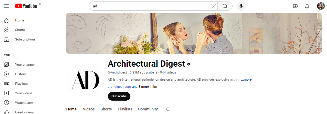
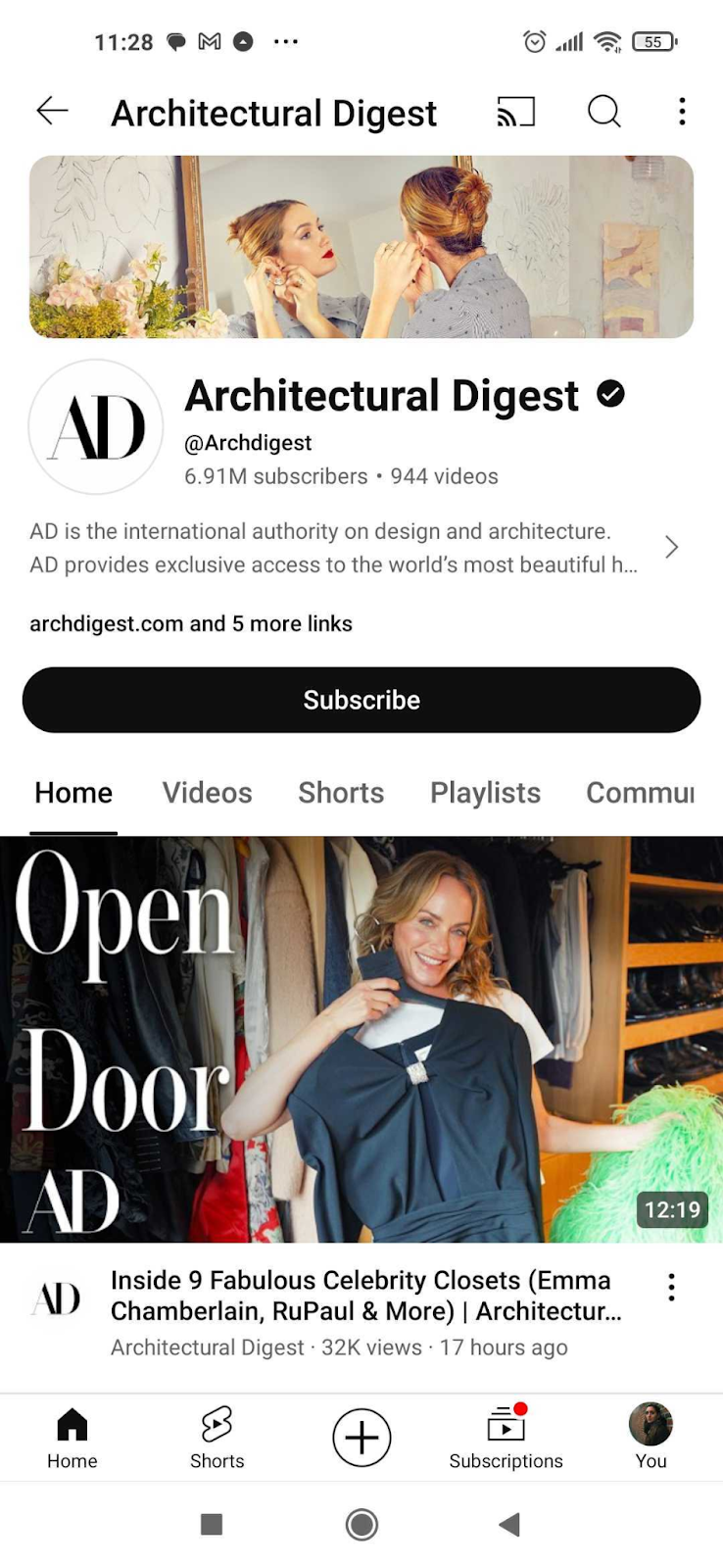
Here’s a good example from Architectural Digest. Although the image is quite detailed (it’s a high quality photo, it scales very well thanks to a lot of breathing space at the edges.
Aspect ratio
Aspect ratio is related to image size, so if you decide to experiment with YouTube banner sizes (go up or down a few pixels), make sure you’re using the right aspect ratio (ratio of width and height).
The best aspect ratio to use for banner design is 16:9 (same as for YouTube thumbnails).
How to add channel art to a new channel
To create your new channel on YouTube, you first need a YouTube profile. You can easily create one by clicking on the “Sign in” button in the top right corner.
Now, click on your profile picture in the top right corner to open a drop-down menu.
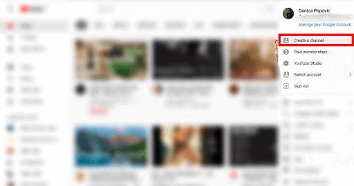
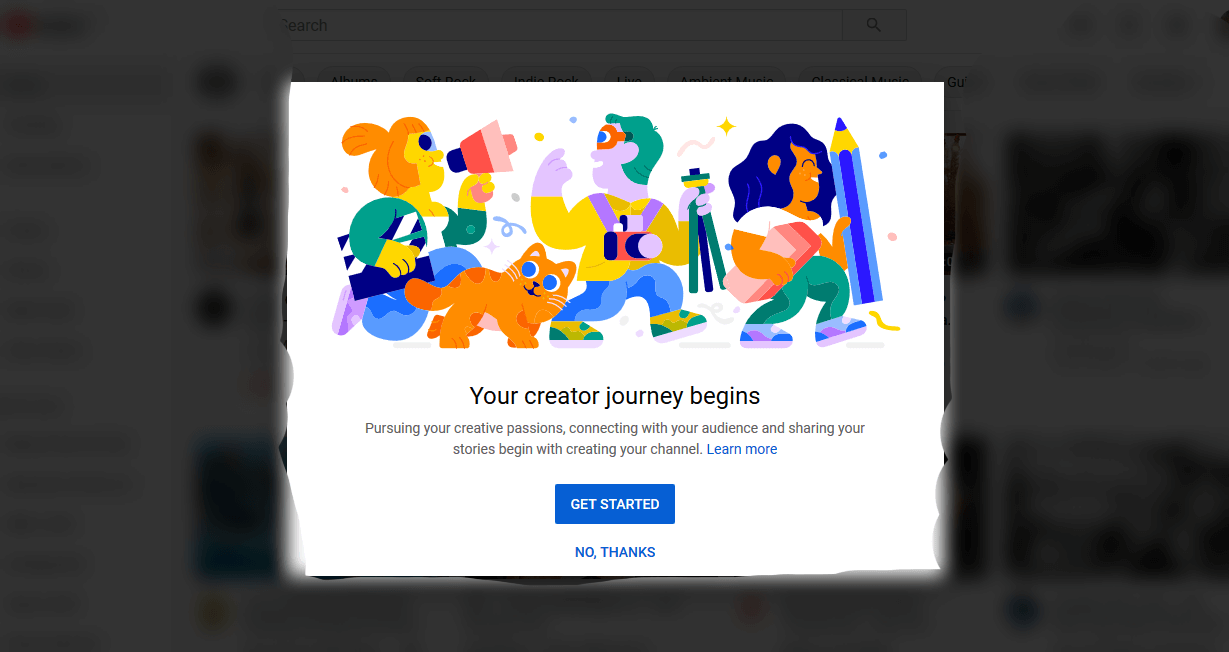
You can use your name (the one used for your Google account), or you can opt to use a different one (for example your brand’s name).
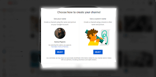
In the next step, you may add additional information, such as links to your social media profiles and website.
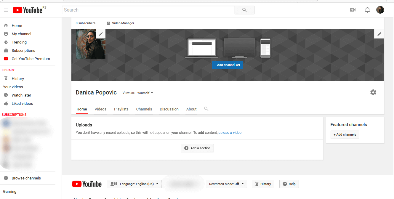
Tap ‘customize channel’ and you will be taken to your YouTube studio. You can edit your channel icon or click ‘Add channel art’.
YouTube banner links
YouTube previously allowed you to add links to your banners. Many channels used to add social media profiles, websites, and current offers links.
This is no longer possible.
However, you can now add up to 14 links to your About section.
This also means that you don’t have to worry about these links covering any important content, making it a little easier to determine and use the right YouTube channel banner size.
Get custom graphics for YouTube!
We hope you found this article on the best sizes for your YouTube channel art helpful. If you want to create banner art yourself, make sure to stick to the recommended size guidelines. That way your banner image will display perfectly on all devices.
For further tips on how to create awesome YouTube videos, make sure to check out our articles on YouTube thumbnail ideas and 20 fonts YouTubers use.
If you have some graphic design knowledge, you can try designing your channel art in programs like Photoshop or Adobe Illustrator. Or you can use one of many YouTube banner templates available online (the good thing about using a template is that you don’t have to worry about banner sizes).
However, remember that a template is no match for custom design. Creating a consistent look across your channel will help you establish a much stronger brand image and start building a powerful YouTube marketing strategy. Not only that, creating thumbnails will be much easier, once you have a solid design strategy in place.
This, however, is definitely a task for professional marketing designers. If you don’t want to waste your time scouring platforms like Upwork and Fiverr, there’s a much easier and reliable solution at your fingertips.
ManyPixels offer flat-rate graphic design services, starting at just $549 a month. This rate covers unlimited design requests and revisions, whether it’s YouTube banners, social media graphics, logos, or even websites!
Get started today, or feel free to get in touch with any questions.
Having lived and studied in London and Berlin, I'm back in native Serbia, working remotely and writing short stories and plays in my free time. With previous experience in the nonprofit sector, I'm currently writing about the universal language of good graphic design. I make mix CDs and my playlists are almost exclusively 1960s.
A design solution you will love
Fast & Reliable
Fixed Monthly Rate
Flexible & Scalable
Pro Designers


.jpg)

.jpg)
